**Preview only**
Be sure to submit your comment
Unlike others, this map doesn't do it for me. I like the features, jumppad placement, textures etc. But gameplay was a bit flat i guess. Maybe it i just me having a 'non chaosdungeons2' day... Well build though.
Agree (1) or Disagree (0)
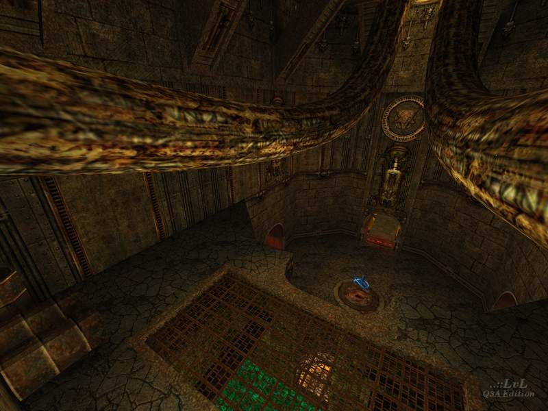
Peecha
unregistered
#37 06 Feb 2001
Gate to hell is a bloody suckin' cool level!!!!
Agree (0) or Disagree (0)
Poy
unregistered
#36 30 Jan 2001
We tested this level on a LAN party (fraglimit=200!). This map is cool!!!
Agree (0) or Disagree (0)
Number 6
unregistered
#35 29 Jun 2000
I think the next Doom should have this kind of atmosphere. Fun with a couple of bots.
Agree (0) or Disagree (0)
Steinecke
unregistered
#34 02 Jun 2000
Sorry! This maps longname is: Gate to Hell. But the wrong version is functioning, too. ;O
Agree (0) or Disagree (0)
Steinecke
unregistered
#33 02 Jun 2000
This map does not appear in the map-menue, 'cause the arena-file is missing:
======windows only======
Copy this to a texteditor):
{
map "chaosdungeons2"
longname "Chaosdungeons2"
bots "uriel"
fraglimit
type "ffa"
}
You can add or replace maps.
File needs to be named <your name>.arena and to be saved to a folder c:/scripts; zip up folder with directory structure as <yourname>.zip; change extension to .pk3
(This is a condensed version of LVL's script.)
Agree (0) or Disagree (0)
Rave
unregistered
#32 21 May 2000
Digster.the whole friggin night?
I guess you win the price ;)
Agree (0) or Disagree (0)
DBD
unregistered
#31 20 May 2000
For me, this map is a mix bag of feature I like and features I dislike.
The good is the care of details, the complex architecturing, the little touch of originality and the excellent connectivity.
The bad is the slow fps, the cramped places, corridors and stairs. For me, too many parts are too narrow, at least a lot more narrow than usual.
The result is that I feel cramped in this level, and wasn't able to enjoy playing it. This was probably increased by the not so good fps I suffered, and even a texture use, architecture complexity and amount of details very high making seeing not easy.
I don't say that a rich use of texture and big amound of details is bad just that it doesn't help combinated with the other features I suffered.
The main problem is the too narrow thing in my opinion or just my feeling. When I compared with all ID maps and most good maps, it's clear that this map is more narrow than usual and I don't feel it good.
I gave it 4 and yes, it's just me, fps didn"t help.
Agree (0) or Disagree (0)
Digster
unregistered
#30 19 May 2000
I saw the map, I graped the map and played it the hole night against my friends! sorry for my spellingmistaks.
Agree (0) or Disagree (0)
BoomByeBye
unregistered
#29 14 May 2000
I haven't even played this map but look forward to doing so on tuesday when my new flat gets a line. So spare a thought for the connectionless one and don't take cool stuff for granted(grunted?)
Im hungover
Agree (0) or Disagree (0)
Hi-C
unregistered
#28 02 May 2000
Yessssss -- I like this filthy look! Many satisfying details, engaging layout. Nice work, nihil.
Agree (0) or Disagree (0)
Rave
unregistered
#27 29 Apr 2000
Scampie ....I understand what you're saying..
Talking it about quake (one), I've made dozens of test maps and dozens of crap maps and dozens of ..uhm maps and so on blabla
But that doesn't mean , when it comes to your gazillion quake arena maps, that you have to put them all in the skirmish menu...
Ever heard that story from that silly boy who added to many maps to his skirmish many and;....what followed wasn't pretty: the house burned down 'cause ( yeah it's an open ending here!)
OH YES...this maps is absolutely magnificent or you know...good. lol
Satisfied now Sicdeth?
Agree (0) or Disagree (0)
Impy bastard
unregistered
#26 29 Apr 2000
Ashley and kate
You're SO DAMN RIGHT! :)
I mean why would we, lazy peeps, have to type in the mapname in the console?
But on the other hand, making that arena file uuuugghghg )
:)))))bb:b:)b:b
No i'm kidding ( no kidding )
Damn shame ID always made it so ...uhm..well sometimes their game interface isn't all that..you know
BUT SHE IS o)
Agree (0) or Disagree (0)
pjw
unregistered
#25 28 Apr 2000
This map is amazingly fun! I kept finding new fine touches for quite a while as I was playing. Just really nice; certainly a keeper for me, and will be added to my "KickAss Maps" list on my site soon. (
www.quakeheads.com/~pjw) Is it just me, or did anyone else think that there should be something on that pipe extending out over the fog though? :-)
Tig: Very nice little how-to.txt on arena files, although I'm icy-cool enuff that I stumbled into it . . . er . . . (cough) . . . figured it out already. :-)
Agree (0) or Disagree (0)
Jim
unregistered
#24 28 Apr 2000
Even though this map has less teleporters- I like Chaos Dungeons better. This is definately a good map tho, and the author has established a good style. 8
Agree (0) or Disagree (0)
SiCdeth
unregistered
#23 28 Apr 2000
whoops "...wonderful maps..." should be "...wonderful map"
that damn typo bug!!!
Agree (0) or Disagree (0)
SiCdeth
unregistered
#22 28 Apr 2000
its a shame that the comments page for this map turned into a convo about .arena files instead of this wonderful maps, how bout u people download the map and play it then come back and actually talk about the map, i know it sounds like a stretch, but hey it might actually work!!!!
Agree (0) or Disagree (0)
Scampie
unregistered
#21 28 Apr 2000
Astram - i disagree, id has done a wonderful job adding the maps to the select map menu. Being a mapper, I have millions of small 1 room and unplayable .bsps running rampart in my /maps dir. if id had done as you suggested, i would have to wade thru to find acual maps.
any mapper who wants their stuff to get noticed should be adding .arena files. it takes 2 seconds.
Agree (0) or Disagree (0)
pottymouth
unregistered
#20 28 Apr 2000
I took a shit but forgot to wipe my ass
Agree (0) or Disagree (0)
*Ashley Olsen*
unregistered
#19 28 Apr 2000
I think we SHOULD GET IT ON!!! ;)
Oh yeah, nice map
Agree (0) or Disagree (0)
*Mary Kate*
unregistered
#18 28 Apr 2000
I think it should be standard, all map makers INCLUDE A .arena file do yer stuff appears in the menus!
Agree (0) or Disagree (0)
Impybastard
unregistered
#17 28 Apr 2000
Tigger-on and steinecke
Thanks for helping me out.
:)
....It's not that I'm too lazy too type the name of the map in the console..er;...
yes I am too lazy
:B
Agree (0) or Disagree (0)
Chuck
unregistered
#16 27 Apr 2000
It's a great map, but I prefered the one before this one (chaosdungeons1). More fast paced or something...
Agree (0) or Disagree (0)
Steinecke
unregistered
#15 27 Apr 2000
I'm looking at the poor currently score for this map: only 7.75. I guess You're all gone crazy ?!? This map earns much better!
Agree (0) or Disagree (0)
SiCdeth
unregistered
#13 26 Apr 2000
Behold the mother of all maps! I wasnt sure if i should download it at first because of the size (i'm on a slow connection) but i figured what the hell and went for it, and im really glad i did, i love seeing such EVIL settings as these, i was getting pretty damn tired of all the base type military maps (ex: senndm2, lun3dm1, these maps are good but theyre just...boring)
This map is also one of the only maps where the bots actually gave me a challenge, i was impressed by everything this map had to offer, from the glowing sludge to the custom teleporters and bounce pads. There was only 3 things that i didnt like about the map, one was the platform above the quad/regenration with nothing on it, what the hell was that for. 2 was the stairs, how u can go up them fine, but on the way down you start hopping. and 3 the absence of the .arena file, such a great map should be able to sit beside my other great maps in the skirmish menu.
The best map on this site to date, but those 3 things hold it short of a 10. so i'll give it a 9 (the highest ive given a map on LVL.
(9)
Agree (0) or Disagree (0)
Steinecke
unregistered
#12 26 Apr 2000
You can use a downloaded mapfinder. 'UI' works properly.
Agree (0) or Disagree (0)
Impybastard
unregistered
#11 26 Apr 2000
Silly question:
how do I put my maps in the skirmish menu, since i'm not too familiar with this..
Hey fragger's gotta start somewhere!
Agree (0) or Disagree (0)
KODIAK
unregistered
#10 26 Apr 2000
Szep munka!!!
It looks just as good as the first one but playability is up by at least a 100 percent!
Nice work. It is really not your average Q3a map so download it!
Agree (0) or Disagree (0)
Raven
unregistered
#9 26 Apr 2000
mmmmm, very nice, 'bit small, but hey, I couldn't even make a shoe box, so I'm not really complainin',.....Thanx
Agree (0) or Disagree (0)
MEet-CEes
unregistered
#8 25 Apr 2000
. . . fark?
Agree (0) or Disagree (0)
Tigger-oN
unregistered
#7 25 Apr 2000
fumin! - try the following at the console;
/map chaosdungeons2
Agree (0) or Disagree (0)
fumin!
unregistered
#6 25 Apr 2000
can we get some maps that are in the fukin skirmish menu???!!!??? took me too fukin long to get it and then i couldent even play it, not even thru the console,... fark!!!!
Agree (0) or Disagree (0)
Steinecke
unregistered
#5 25 Apr 2000
A little more fog would have increased the 'organic' look.
But anyway -it's a great map! I' m giving 10 points.
Agree (0) or Disagree (0)
Astram
unregistered
#4 25 Apr 2000
I'm with Johnny on the map selection bit in the menu. I rekon id should get their act together and make a decent map interface.. and the demo interface gets pretty damn messy too. yuk.
Anyway.. :) Love the map. Great new textures... Love the Doom Demon skull. I also like the room with the dirt floor. Notice how it's not just flat but concave?. Maybe I'm easily pleased but I really like that effect.
Keep it up man.
Agree (0) or Disagree (0)
OozE
unregistered
#3 24 Apr 2000
Purrrfect atmosphere...damn it's good. Even the music selection is right on.
Nice work! Incredible graphics and mood make this one a keeper!!!
Agree (0) or Disagree (0)
Belial
unregistered
#2 24 Apr 2000
Damn, I love this map.
Agree (0) or Disagree (0)
Johnny Law
unregistered
#1 24 Apr 2000
No .arena file in the pk3... must... strangle. Why expect people to have to memorize the bsp names of all the maps they have? Put your maps in the Q3 skirmish menu!
OK, pet peeve aside, this one's pretty good. Same funky Sewer Of Evil look as its predecessor, but less emphasis on a wacky teleporter network and traps for sliming you to death = better play. Fun stuff with a load of bots, maybe a little topologically "flat" for my tastes but probably just right for some other folks.
Agree (0) or Disagree (0)

