Added 20 Oct, 2009
Comments
Add a comment
**Preview only**
Be sure to submit your comment
Be sure to submit your comment
Submitting comment...
map loading to menu can be fixed by modifying the arena file to match map file, levelshot and pk3. Really like PaN61s
suggestion about moving the shotgun to the upper area (it really is a matter of choosing quicker route with little/no items or the longer path with weapons and armour). I'm always on the look out for small ctfs these days. but I think there are better one's out there
Edited 28 seconds after the original posting.
Edited 2.4 hours after the original posting.
Agree (1) or Disagree (0)
Well, you did your best for your very first map Bek.
Then it's settled, :D 7/10.
PaN61
Edited: 05 Jan 2010 AEST
Agree (0) or Disagree (0)
I'm not mad, made TONS of nooby mistakes :D Thanks for the feedback, really appreciate it :)
Agree (0) or Disagree (0)
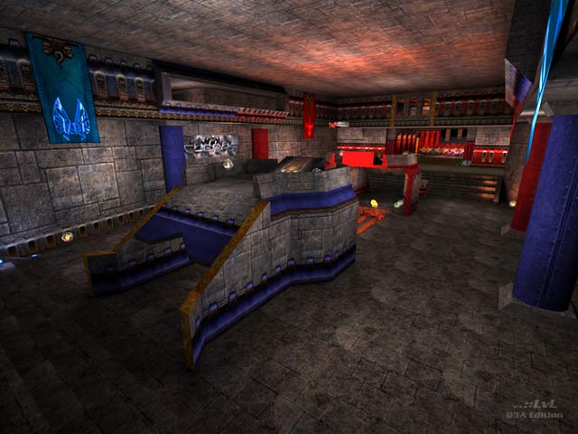
Nice weapon placement, but I think that the Shotgun and the Shotgun Ammo next to the Shotgun are a bit too close to the Plasma Gun on each bases side. (I'm not blaming you on where the weapon placements are) But maybe you should have put the Shotgun and the Shotgun Ammo next to the Shotgun on the level were the flags are. Textures are good, excellent Sky Box, good lighting.
Congratulation on your first map Bek, I give it a 6/10
Keep making better maps.
(Don't get mad at me because of the Shotgun complaint. I will give the map a 7/10 if you don't get mad at me, Bek)
PaN61
Edited: 05 Feb 2010 AEST
Agree (1) or Disagree (0)
The only thing that I mentioned was a ceiling...From designer's side. Next time make it more articulated, make some windows/girders/ or just add some texture variation. Good luck ;-)))))
Agree (0) or Disagree (0)
Thanks so much for the review, hopefully now that I've moved on to Unreal engine 3 I can create some better levels, keeping things interesting. You're right as the upper hallways are very plain, and I should have spent more time working on lighting and gameplay. Overall though, I'm happy for my first map, not sure why the menu doest work. For memory it was working at one point, I must have screwed up something there.
Anyway, thanks for the time taken to review, and to anyone who still plays this game and bothered to download :)
Agree (0) or Disagree (0)
