Added 28 Jun, 2005
Comments
Add a comment
**Preview only**
Be sure to submit your comment
Be sure to submit your comment
Submitting comment...
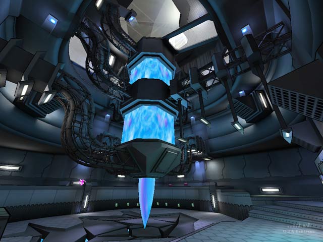
I just can't get used to maps with strange 'architectural' things in them. Like this blue slime generator sort of something. Just not my kind of aesthetics...
Edited 12 seconds after the original posting.
Edited 12 seconds after the original posting.
Agree (0) or Disagree (0)
I agree. This map is gorgeous. While bad mapmaking practices aren't something that should be encouraged, obviously, this map has the chops to at least have some forgiveness applied to it.
Most of the highly rated maps that the reviewers drool over don't even look like this map's piss.
Agree (1) or Disagree (0)
good review!
but i think this map is a bit better than the review makes it seem.
this has some really nice construction and texturing. reminds me on one level of dm-coolblue from that "other" game i play.
the layout is a bit simple, and hindered by those jump pads. some when you jump up , you have to move forward. some you have to move backward, and there is no visual que as to which. if the pads could be used more instinctively, the gameplay would be much better
there are some really great visual effects. i'll keep playing this just to see the beautiness!
that "flying" pickup opens up a whole range of exploits. VERY NICE!
the texture on the transporters is sub-par, not really on the same level as the rest of the visuals.
keep up the good work KIIIA! you have a great artistic bent
Agree (0) or Disagree (0)
