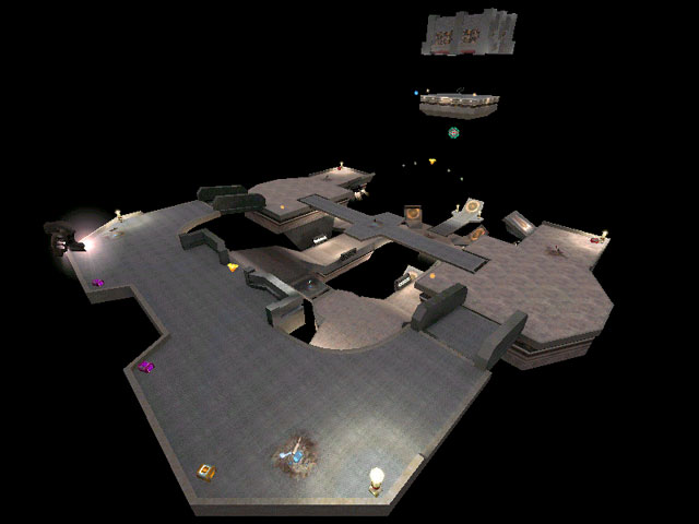
Added 16 Mar, 2000
Comments
Add a comment
**Preview only**
Be sure to submit your comment
Be sure to submit your comment
Submitting comment...
It's possible this was built on the Q3DM17 map file in the Q3Radiant editing tools.
Agree (0) or Disagree (0)
Still good for an occasional game, this one :) bots seem to do ok. They don't shoot the trigger for the crusher though.
Loved playing this map with the aqualung mod =)
Agree (0) or Disagree (0)
Very fun and fast paced Space map (which are my favorite) - nicely done QuartZ!
One drawback is one of the lower/bottom launch pads (that shoot you up to the 'Mega Health') may be misplaced; if you hit the first one too high, you'll miss the second one everytime.
Other than that 'one' thing, everything else about he map ROCKS!!!!
Agree (0) or Disagree (0)
A very fun space map - I played this for nearly an hour solid after I got it. Bots run well, the map is well constructed and laid out ( always not quite enough room to feel safe... ) and I give it:
8/10
Agree (0) or Disagree (0)
A decent Space map - nice and fast
Agree (0) or Disagree (0)
As Octo said, this map is the closest thing that u can get to DM17, which i think was the best map ever made... The invisibilty wasnt needed. But its up to u for getting it.
Agree (0) or Disagree (0)
Really good and fast map.
Maybe Quad instead Invisibility would be better?
Agree (1) or Disagree (0)
Well there is no way it can compete with good old DM17, but it may be the closest thing to it so far. Just a little aesthetics tweaking and it would be great. Nice layout, unlike most space maps (with the exception of DM17) it could be figured out in a matter of moments, not wandering around going "OMG where is that RL?" The PG was perhaps a little disused, the central RG meant campers were doomed to die, and things just seemed to fit. It was nice to see the crusher being used in a custom map, but I agree with Tig that in a very nice map it stood out as an odd, almost mistake seeming thing. The invis was just not worth it, because as soon as they hear that "invisibility" from when you pick it up, say goodbye. A quad might truly have made it worth the trip/risk. Still a very nice map, 8 outa 10 from me.
Happy Fraggin! Octovus
Agree (0) or Disagree (0)
i kept it in my baseq3 folder. 'nuff said.
Agree (0) or Disagree (0)
QuartZ - some of the larger trim or edge brushes (square cuvre brushes) you have butted up against normal brushes. As the square curve has a soft light fall (that effect that makes a square brush look like it has rounded edge) it looks wrong next to the normal brushes. Have a look at how idsoftware get around this on the sampleq3dm17.map, its pretty complex. The texture aligment problems are where you have used .shader on the weapon locations, it just ain't aligned at all - don't know if that makes it clear or hazy :]
Agree (0) or Disagree (0)
this is a pretty good space map
its different from the others out there, which is good.
Agree (0) or Disagree (0)
This wasn't too bad of a map. I prefer as much originality as I can get, so I wasn't too fond of having elements of DM17 and tourney6 present, but the overall layout and gameplay made up for that. I did enjoy it and will probably keep it. One thing about the DM17 jump (where the yellow armor is), the pads send you too high, as I often went thru the arc while missing half of the health powerups. And it would have been nice if there was a break in the symmetry somewhere, and maybe a bit easier to be in the wrong place.
Agree (0) or Disagree (0)
I'm glad to see someone like SCSI3 actually took the time to analyze WHY I made the map the way I did. I generally dismiss reviews this short as those here on LvL. They usually don't look into the map well enough to understand level design.
I always d/l a map if I think it looks promissing regardless of the review it gets here.
btw tigger...where is the texture prob on the square cylinders? I am just curious, cuz I don't see any.
Agree (0) or Disagree (0)
damn addictive map, nice to see the first space map that actualy rox.. Good thing to put the invis there, whoever takes it must have lots of luck :P
Agree (0) or Disagree (0)
"The invisablity is not really worth going for." Ha ha ha, that is a good one. Try getting the invisability, and then jumping down onto the railgun. Easy frags. Hmmm. . . someone missed the point completely.
Agree (0) or Disagree (0)
Hey you can check out my new web site (Hosted by Quake3Stuff.com) and see what I'm up to as well as read about my maps. It's my personal level design site and it's just getting rolling so stop by and leave me some email while you're there!
Agree (0) or Disagree (0)
