**Preview only**
Be sure to submit your comment
SW12
unregistered
#13 16 Apr 2010
You cannot imagine how much this map resembles the map LIFELINE by Mikko Sandt. Exact same skybox and scenery. The real difference is that this map has CTF. Lifeline doesn't. But lifeline has a gimmick map that has snow. Again, I can't imagine that it was two different authors.
Agree (0) or Disagree (0)
Creative design a clear 10, but layout is a 3 or 4 at best.
Alas, another case where the cool architecture, and awe-inspiring design, gets in the way of "good" concise layout. Too many rooms that look pretty much the same, too much empty space and too long paths, prohibit consistent gameflow IMO. And the fact that the areas "are closed off" by vertically sliding doors, that don't completely drop into the floor do not help either.
I'd wish this map would be revamped, to create a more concise gameplay experience, using the already defined design elements.
Agree (1) or Disagree (0)
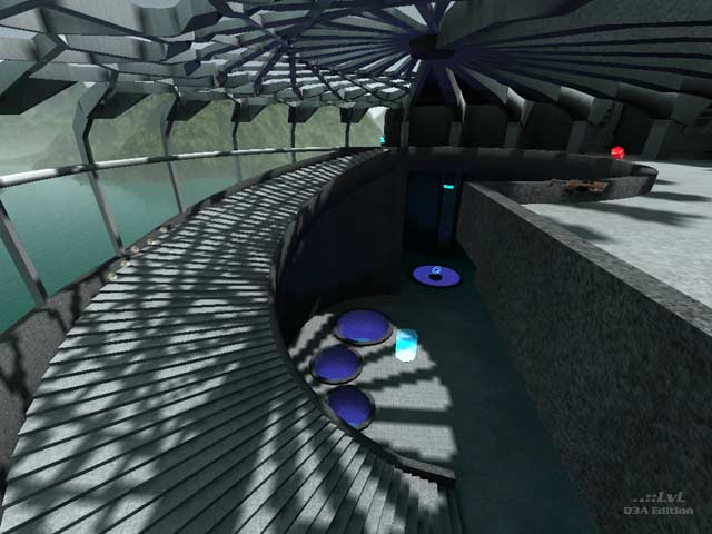
This is a bad map. Tehnically it has some nice features but gameplay wise it has nothing. The problem is I don't think it looked very good visually either, baring the very nice room seen in the screenshot.
The scale of everything was wrong. It would have been nice for example to rocket jump back up onto the walkways. The fact that everything was so large meant that nothing felt huge. You need some things smaller sized to put the big things in perspective. The ceiling was great but the blue lighting just messed up the nice daylight effect that was coming through. The doors were ugly too. I really liked the room shown in the screenshot, particularly the top level with the side struts, they would have provided great firefights if used better.
Item placement is all over the shop. There's virtually no reason to go to the top levels on any part of this map except for one area. What is the point of going up to the top level for a shotgun when there's an RL on the ground floor? Bots get stuck in a couple of places in the map too. The quad is in such a stupid place no one ever goes for it. The deathpits don't really serve a purpose either.
Baring part of one room none of it really works over all.
Agree (0) or Disagree (0)
CTFX1
unregistered
#10 18 Aug 2003
i couldnt load the map at first, i have 512 ddr 3200 ram, and 3200 mhz amd cpu and the latest graphic card, nvidia fx 5900 plus tons more, can i replace that 120 to 512?
well anyways about the map itself, i thought that the architecture was pretty good, however not for gameplay. i thought the second stories floating slightly like they were held up by suspensors was one of the coolest and most brilliant original ideas i've seen. the blue lighting is really cool and contributes to the map, i played this with 4 bots on my super super rig and it was still laggy. imo this isnt really for the hardcore players, this is for the mappers to look at with gameing graphics improveing every day. my favorite room had to be the spiral staircase and the 2nd floor suspensor with the secret telport tube.
Agree (0) or Disagree (0)
-*DMF*-ORANGE9mm
unregistered
#9 04 Jun 2003
This map is nothing short of extrodinary. The structure is brilliant and the atmosphere is that of a future setting. I would like to see more from this author. I think that the editorial written on LVL is a bit too harsh and shallow. I love this map.
Agree (0) or Disagree (0)
Darth_Blade
unregistered
#8 16 Feb 2003
Bravo tanyeli,in one word:"Mukemmel"(you know what I'm talking about)
Agree (0) or Disagree (0)
Qix
unregistered
#7 23 Dec 2002
if the map doesn't load then like me you might have got a "hunk_alloc failed" error. you will have to scroll up the console to see the error. typing "com_hunkmegs 128" and restarting quake3 should allow enough memory to be set aside to load the level (/map tanq3a_dm1).
Agree (0) or Disagree (0)
Carolyn
unregistered
#6 23 Dec 2002
how do you load this level?
Agree (0) or Disagree (0)
Qix
unregistered
#5 21 Dec 2002
com_hunkmegs 128 was good enuff for it to work. thanks tanyeli. i was on hunkmegs 56 which is default i suspect.
this map has some really nice architecture. there is alot of geometric detail and i'm surprised the map still ran fast. impressive work.
Agree (0) or Disagree (0)
tanyeli
unregistered
#4 20 Dec 2002
com_hunkmegs 256
try this, it looks like q3a is not aware of your memory.
Agree (0) or Disagree (0)
Qix
unregistered
#3 18 Dec 2002
I can't load the map either. sv_pure 0 didn't help. I get Hunk_Alloc failed on 1209856. I have a p3-800 with 512 mb ram so i'd imagine that should be sufficient.
Agree (0) or Disagree (0)
tanyeli
unregistered
#2 18 Dec 2002
try switching pure server on/off...
Agree (0) or Disagree (0)
remnent
unregistered
#1 16 Dec 2002
The reviewer failed to realise that the reason this map is an "architectural exercise in brush based editing" is because it is. It was entered in the geocomp2--
www.planetquake.ne...allengenews.htmI can't load the map- if anyone has suggestions I'd like to hear them. Maybe /devmap will allow me to load it, but haven't tried yet.
Agree (0) or Disagree (0)

