**Preview only**
Be sure to submit your comment
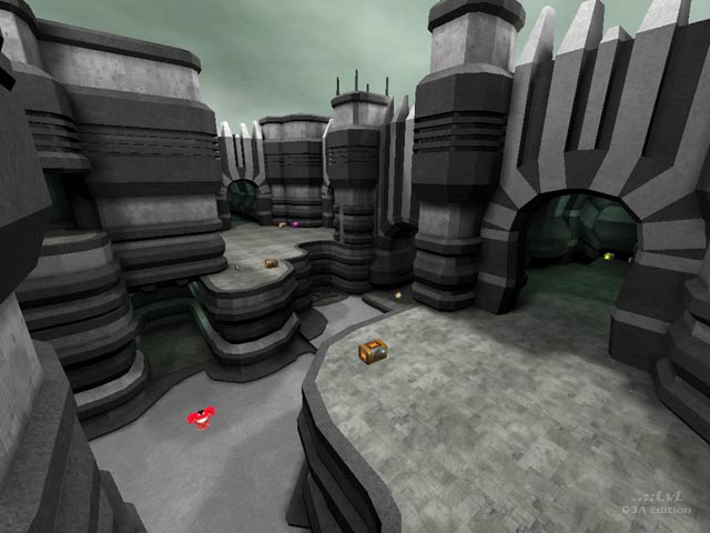
Aesthetics are great but map is too flat and item location is not good. Gameplay peaks quite quick. A shame. It had a lot of potential.
Agree (1) or Disagree (0)
Fantastic map, 10x
Agree (0) or Disagree (0)
@CZGhost: I definitely agree with you. Q3 is the best Quake game out of the whole series plus people still play it today like me, You and many others :). Team Arena is one of the best game modes anyone can ever play. To me it's thrilling, fast & extreme which i love and also TA maps are brilliantly made (Depending on who made it). The original game modes like DM, CTF, TDM, TA etc.. are the best and well worth playing.
Agree (0) or Disagree (0)
Yeah, that's right. Suma Sumarum, new game developers haven't much ideas... And I say, the simple game is better than fussy game... Quake 3 Arena is the multiplayer edition (unlike other series - quake 1, quake 2, quake 4), haven't singleplayer missions (have singleplayer challenges with botplay, just similar to multiplayer free for all)
And it's too great game, the clearly multiplayer edition of quake is amazing...
Team Arena is also more clearly designed for multiplayer (but nobody plays it on Internet), have mind of teamplay... Bots are designed and programmed specially for teamplay in CTF, OneFlag, Overload and Harvester...
Edited: 12 Feb 2012 AEST
Agree (0) or Disagree (0)
@CZGhost: Yeah :). It just shows that old games are the best. Like they say, 'Old Is Gold'
Agree (0) or Disagree (0)
It's amazing, how the old game can be returned back to life...
Agree (0) or Disagree (0)
Nice Work!
Agree (0) or Disagree (0)
I rather like the map just the way it is, even with the bounce pads almost blending in, being difficult to make note of, and the hall ways being somewhat gloomy. The disconcerting lighting through the corridors adds to the atmosphere of the map and the application of more light containing the full visual spectrum would make the map so different that its look and feel could be compromised. Everyone has their own preferences and I am not making light of that; the fact is that the unintentional outcome of this maps' overall appearance works for me.
Agree (0) or Disagree (0)
Artistic expression and all that is great, and the architecture in this map is amazing, but why do the indoor areas (corridors) need to have that dark greenish light, that makes it really depressing to run through them? Turn up the light! The outdoor areas are much better, IMO.
Agree (0) or Disagree (0)
A real show down of the ra/rl vs ya/rg combo. the corridors make for some great rail-rocket exchanges. the architecture works toward gameplay - the trim can either land that strafe jump you nearly didnt make or catch you on a bouncepad. i may just include this 1 in my ultimate map collection.
Agree (0) or Disagree (0)
Salinga
unregistered
#9 21 Sep 2002
This map is Q32EF compatible, so it can be played with "ST: Voyager - Elite Force".
To find out more about the mod, visit:
q32ef.fragland.net/
Agree (0) or Disagree (0)
Jaj
unregistered
#8 21 Aug 2002
Thanks for your comments guys.
I had liked to refine some things in this map, things like,as you say,the jump pads, i should have added some shader effect on to make them more evident.
Also the illumination maybe a bit dark on hallways...i have to take it more seriously (not that i treat the light as a joke...:)).
Well, with a bit more time i could have corrected some things but deadlines are deadlines, and this map took 2 days to make the only the vis procces on a P4 2.2!...once started this couldn't be stopped =)..
About the reference to "A brave new world", i didn't know it, i'm curious so i'll read it =).
Also thanks to MindlessPuppet for the review, i couldn't find your mail address, so i thank you from here.
Jaj
Agree (0) or Disagree (0)
Yarg
unregistered
#7 20 Aug 2002
likes: color scheme, some nice architecture Dislikes:tight/long corridors, low fps in some open areas, lighting too dark in some places, everything looks to the same(blame it on the geocomp2 texture limits)
overall: good job. 7.5
Agree (0) or Disagree (0)
Shagz
unregistered
#6 20 Aug 2002
Good looking map, some nice playability, but yes the jump pads are kind of hard to see and the bots really, really like the YA room. They seem to run in circles, going up the bounce pad, down to the ground, then back up again. (?!)
But it's a great map against human opponents. Like he says, great for a LAN.
Agree (0) or Disagree (0)
Tigger-oN
unregistered
#5 20 Aug 2002
Kell: The Huxley link was a mistake on my side. It should have been .net not .com - its fixed now anyway, thanks for that.
Agree (0) or Disagree (0)
Kell
unregistered
#4 20 Aug 2002
Great looking map - I really like the color combination and the stratification of architecture.
But why does "A Brave New World" link to the website of some recruiting agency? It's not actually Aldous Huxley's personal site, y'know...
Agree (0) or Disagree (0)
Tetzlaff
unregistered
#3 20 Aug 2002
IMO one of the best looking maps, great architecture and very strong athmosphere.
The ammo placement could need some work.
Agree (0) or Disagree (0)
nitin
unregistered
#2 19 Aug 2002
brushwork is top notch, lighting leaves a lot to be desired, gameplay is ok. I think it suffers though because all the atriums look too similar and it's a bit too flat.
Still, one of the best geocomp maps though.
Agree (0) or Disagree (0)
StormShadow
unregistered
#1 19 Aug 2002
This was my personal fav geo comp map.. the brushwork is fantastic! Its not great in terms of gameplay (low fps), but dl this one for the aesthetics alone.
Lovely work
Agree (0) or Disagree (0)

