Added 12 Jun, 2002
Comments
Add a comment
**Preview only**
Be sure to submit your comment
Be sure to submit your comment
Submitting comment...
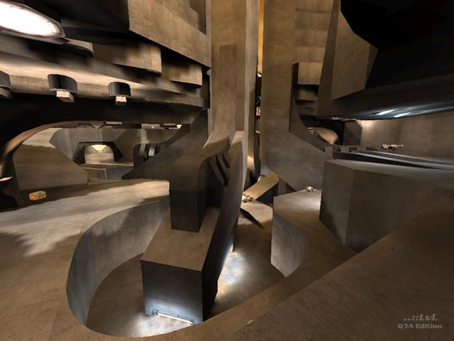
I agree with AEon. The Gameflow did lack a lot but I actually love the designs of GeoComp maps. This one lacked colour which really did annoy me.
Agree (0) or Disagree (0)
Somehow it really saddens me that all these GeoComp maps - as much as I admire their design - have such terrible layout and gameflow. The complete central area is one big death trap, and the PG room (behind doors) looks cool, but does not add anything gameplay-wise. It seems creative architecture (brush/patch-work) seems to exclude FFA playability, alas.
Agree (0) or Disagree (0)
