**Preview only**
Be sure to submit your comment
Nice map. I love terrain maps. It did call to my attention the lack of TA weaponry and the lack of runes. Or maybe I didn't look hard enough.
Tried in OpenArena while redoing the mapcompat lists to report for missing textures and sounds. It does have a few, but it's nothing too distracting from the athmosphere.
However the .arena file has a problem. Because of a rogue quote, the game may complain about a rogue .arena file. Here's the culprit line.
quote" "big boobs are better than small tits"
That " at the end of quote causes the problem, so I made a patch.
mega.nz/file/yABxEArJEdited 12.46 hours after the original posting.Agree (2) or Disagree (0)
Cool map but bots don't make it fun to play. It needs (lots of) humans, which in these days is not something likely to happen.
Agree (1) or Disagree (0)
I've already played it and the map is amazing and it's very large!! Awesome!!
Agree (0) or Disagree (0)
Simply Beautyful, Thanks Bro!
Agree (0) or Disagree (0)
Looks amazing!
Agree (0) or Disagree (0)
I agree with the review and I'm so embarased I haven't voted yet.
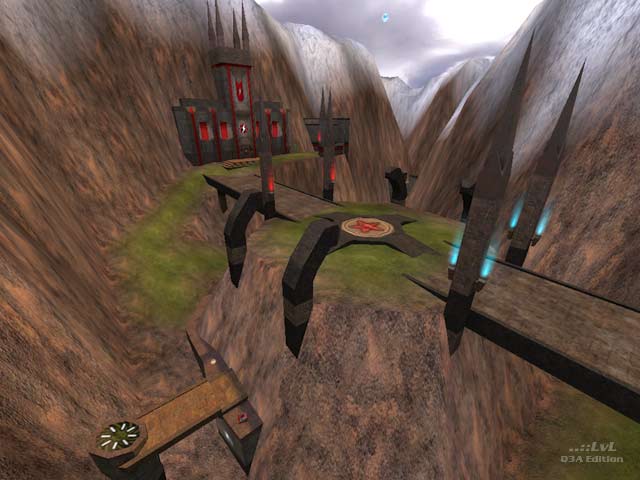
Firts of all, the design: It's realy great how the terrain looks like. Amazing brushwork in the gothic style and the snowhills are realy nice. Yes, the sky's hypnotic. I'm impressed...
The functions and sounds: I realy like the falling gravel near the ground edges attached to a trigger that plays the sound in the right time...
The botplay: Bots play fine in Team Arena (seem to be much stupid than in regular q3, but it's the page of mod), they exactly know what they do, unless you're away from your teammates. If you're too far from teammates, they easily fall in the siege because of their stupidity...
In shorten words: Your level's so great, I realy found hard to stop playing. Excellent map: 10/10
Agree (1) or Disagree (0)
I've tried the Team Arena again, thanks Kit Carson & Nemo for the level, great touch...
I've recorded smooth demo for the level and I share it you to look, how I'm playing this level. It's pure lucky I've won, or not?
dl.dropbox.com/u/7..._demo0001.dm_68
Copy it in your <quake3installationpath>/missionpack/demos directory and don't forget to download the level if you want to look ;)
@Tig: The level is actualy named The Age of Tenetra
It's named in the levelshot and actualy with prefix KineTerra1: in the worldspawn entity...
Agree (0) or Disagree (0)
I would also like to point out that the ambient music in the gothic chapel-bases are from Age of Empires II. I love that game as it was what came to my mind when playing this level. This level is excellent with as many players as possible.
Glory of the old times. The Goths, Old English, and such, it's been so long. 9/10
Agree (0) or Disagree (0)
Intresting Map! Looks cool.
Agree (0) or Disagree (0)
A very ambitious map, the terrain is well-modeled, better than what id software produced (like MuffinMan said), and the waterfalls are a nice touch. But as far as the buildings go, it looks like they were done hastily to get the map released, rather than polishing it off before sending it out to the world. Some areas look good, such as in the screenshot, but other areas (especially indoors) have somewhat poor brush construction and feel sloppy somehow. 9 for effort though.
Agree (0) or Disagree (0)
5/10 just because you think it's ugly? Personally I think the terrain has been done very well (much better quality than standard Q3TA terra maps). The texturing may be strange (ie: the snow on top of the hills), but it's got good geometry and the textures are mapped perfectly over it. The buildings are well constructed. The yards with the trees are a nice touch as well as the building near it acting as a choke point of sorts as well as breaking the terrain up so it isn't so monotonous.
The gameplay (the important part) is quite good imo - open spaces like a terrain map should be, but with enough vis blocks and limited slugs to make sure that the railgun is never overpowering. The central field could do with a few changes though to speed things up there, and some more health added.
8/10 from me. A few improvements and it could be a 9 or 10.
Agree (1) or Disagree (0)
Anthraxxx
unregistered
#17 14 Nov 2009
When i look at this map i see 3 things. 2 vantage points at the 2nd brige and the castle. An awsome long range firing point also from the castle. I also see a great battle field for team effort.
Agree (1) or Disagree (0)
it is already hard enough to get to and from a base in a large terrain map as it is. Kamikaze in the bases only makes it worse. The MH in the centre is also too high to grab even with scout or haste. I don't know if promode or other ctf mods changes this, but that megahealth is really crucial, especially if you're carrying scout and can't pick up armours, but is just way too tricky to be worth grabbing.
Edited 4177.25 days after the original posting.
Agree (0) or Disagree (1)
Qmf banana
unregistered
#15 09 Sep 2004
Hey how did they make those waterfalls i downloaded this map and got the textures but it isn't a shader it will be still my question is how did they make em move?
Agree (0) or Disagree (0)
(void *)
unregistered
#14 04 Jan 2004
One of the rare terrains that makes you forget that you're actually sitting in front of a PC playing a video-game.
Yes, this is it! Connecting to a Terraserver spectating on 2 european teams. Looks like Britain vs. Holland 2night. Flying above the area you can see the rail being camped by a dutch sniper aiming at the waterfall-area. A group of 2 Players, Scout and Guard aproaching the little bridge. Bang! Scout gone! Meanwhile the door at the other side of the Railarea opens and spits Plasma to burn the sniper. Another scout crossing the center-bridge taking the position of the dead body until his stronger but slower teammate has also crossed the bridge. Together they make it to the enemy-base, where they can see another teammate aproaching the base from the other side. The enemy-cathedral is packed with defenders on the roof and inside of it. After a massive slaughter the british guard is near the flag where there's another dutch defender crouching, holding the kamikaze...
No its not unfair! Its a friggin war, hear me?!?
Oops, whats that whistle? Uhm birds... shit, gotta make it to work. Bah, reality sucks! ;)
If you like terramaps, stop reading! The night is much too short, download this map yesterday!!
Agree (1) or Disagree (0)
Sith Lord Jesus
unregistered
#13 02 Jul 2002
Every time I think I'm gonna drop Q3A and go over to UT a map like this comes along and my lower jaw hits the floor. Damn but if this isn't the phattest I've ever seen for any game ever. Brad's right about needing to play this puppy with people--anyone know of any servers where this is loaded? Anyway, congrats to the creators and I'm giving this thing my first ever full "10" for a CTF map. Rock on.
Agree (1) or Disagree (0)
Chris
unregistered
#12 05 Mar 2002
It's really a great map but it's annyoing to have those flickering textures, like Jim said. I have a gf3 ti500 and detonator 21.83 (23.11 suck). Anyone have an advise? THANX!
Agree (0) or Disagree (0)
rAJmASTER
unregistered
#11 27 Feb 2002
Unbelievable
Agree (0) or Disagree (0)
Gear
unregistered
#10 25 Feb 2002
With my poor PIII-1gig with 512 megs ram and a GeForce 2 GTS, I was getting under 40 fps very often. Strange place where there's a jumppad to a balcony with a railgun where the border is higher than the player so you just may rail the wall :)
Overrall, its nice and indeed the terrain is great with the sky but, I've played it once, and I've deleted it for the same reason as many other comments, bellow ! Great job anyway
Agree (0) or Disagree (0)
Octovus
unregistered
#9 25 Feb 2002
(Another one liner??)
As I said I really dislike terrain maps, and when I was going to vote the average was already 7.4 - rather low for the review - and so I didn't score it....what's so complicated?
Agree (0) or Disagree (0)
hippity-hop
unregistered
#8 25 Feb 2002
"I'd give it a 6 but I won't score it...."
um,.... what?
Agree (0) or Disagree (0)
Tigger-oN
unregistered
#7 24 Feb 2002
I think the review typo CCTF (Capture Strike - Threewave) was a mistake on my side (too many late nights). Its fixed now anyway.
Agree (0) or Disagree (0)
Octovus
unregistered
#6 23 Feb 2002
Oh dear, that's a big reviewer mistake (I wonder where he thought the other C was coming from? Hehe. At least it's still a threewave gametype, so the link makes sense.) First I'm going to say I don't like terrain maps. Way too hard to get that many people together and playing unless it's TA (or a big name mod like 3w). Secondly, the architecture and texturing of the buildings/structures in this level was quite weird. I guess that might have been done to aid FPS but my and my aging computer still had problems. Gameplay was pretty good but I find terrain maps kind of defeat Q3's fast and furious gameplay...
I'd give it a 6 but I won't score it (average is already low and, as I said, I don't like terrain maps much).
-Octovus
Agree (0) or Disagree (0)
Tetzlaff
unregistered
#5 23 Feb 2002
Very nice terrain map. And a good example how ambient sounds can enhance the athmosphere ;)
The only thing I found weird was that jumppad to the megahealth in the middle field, (the risque to get lots of falling damage seems higher than the chance to get the MH). And some flag textures are stretched in a weird way, but that´s just a nitpick.
Will it be included in the next Threewave pack?
BTW, Brad Kiefer, CCTF is Classic CTF (the real CTF with grapple etc.) not Capture Strike }:-(
Agree (0) or Disagree (0)
Kit Carson
unregistered
#4 23 Feb 2002
thanx;)
and don't forget that Nakedape worked too, he did a great work to remove z-fighting in 16bit mode and lot and lot of stuff.
Agree (1) or Disagree (0)
Jim
unregistered
#3 23 Feb 2002
anyone else have texture issues with this map, the snow on the mountains flicker, and some of the grass in some spots, It could be just me as i am using leaked g3 drivers ?
Agree (0) or Disagree (0)
wviperw
unregistered
#2 22 Feb 2002
It is indeed a beautiful map, some of the views are almost breath-taking, but I don't know if i'd go as far as the reviewer has gone w/ that. :)
Nice job kit, nemo
Agree (1) or Disagree (0)
The Loader
unregistered
#1 22 Feb 2002
reminds me of Drakan. Big and beautiful !!
Agree (0) or Disagree (0)

