Be sure to submit your comment
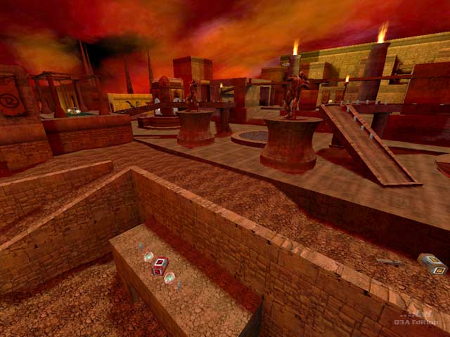
what could have really helped this map is better connections to the main areas. A lot of the pathways are way too long. By way of example, in the (dining?) hall with the gl, the fireplace could have served as a teleport to the sewer for example. The first time I encountered it, I actually thought it was a teleport. Also in the same area, at the top by the YA, the walls aren't properly clipped and you can fall right off the map into the skybox. The grotto could have used some more differentiation as it is rather uniform and disorienting down there, and there are many tunnels that can be hard to find. Some skull lanterns on the rock faces could have been a nice touch. Thr rg secret was nice, and I found a rather "crafty" embellishment to one of the banners out doors.
i disagree (and that should be "mistaken" :P ). There was really nothing good to say about this map. Really, i think LDA needs to learn to distinguish between 'final releases,' 'trash can maps,' and 'learning maps.' Most of his released levels to date have fallen into the latter two categories.
He tends to include very nice architecture in some places but awful and boring in others, along with enough eye candy that the level runs slowly. Combine bad bot play (before you say theres nothin he can do about that i will correct you -- as a mapper myself i can tell you there are definitely ways), and -fastvis, and you will end up with an unplayable, relatively non-exciting map.
Mr Ash needs to utilize some new construction techniques (most notably for the mines. The texture is extremely boring, repeats very obviously, and looks like it was rendered in 16 colour mode). Bots simply cannot navigate through the mines, and it is hard enough for a human.
The sewers were boring looking, and that is that.
The citadel had potential, if the other two areas had been cut out, come more though had gone into the item placement, architecture, and attention to detail, etc. This section alone could have been an enjoyable DM, but the things i have just mentioned killed it completely.
LDA makes good weapons (i use his MG, SSG, and GL) ... but his maps need quite a bit of work. :)
I think LDA surely has creative potential for mapping, and he obviously spents a lot of time on details. But he should start simple and learn to make a small, technical flawless map with good framerates and gameplay,and then go on to the more luxuriant styles later. Not the other way round ;)
-Octovus
