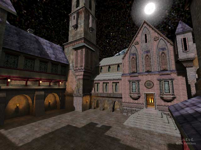
Dracula
by Priv
Dracula by Priv
Comments
Add a comment
avatar
**Preview only**
Be sure to submit your comment
Formatting help
Submit
Preview
Cancel
Submitting comment...
avatar
KommissarReb (SW12) Rep. 2488
#9   21 Feb 2013
I kinda wish this map was based off of the book a bit more. I have no clue why you would make it so the dining table has no chairs, no food on it other than a skull sitting in a pool of blood, and making the windows opaque.

But this is the closest thing there is at the moment, so it is acceptable. I think the reason why the courtyard is so bright at night is that would be the light from the sunlight being reflected off of the moon, which is shown in the skybox. But like Jax_Gator said, the shadow leans on the wrong side. 7/10
Edited 493.05 days after the original posting.

Agree (0) or Disagree (0)
Anonymous unregistered
#8   11 Mar 2009
looks awesome
Agree (0) or Disagree (0)
Nitebeat unregistered
#7   14 May 2003
Jax was right you know. Lighting outside doesn't make sense 0_0...

Guess most people don't really care...

Agree (0) or Disagree (0)
NiteBeat unregistered
#6   01 Jan 2002
Level looks great. Haven't played it yet though :) but I really liked what I saw..

For some reason it made me think of rtcw (the nicely lit dracula room for instance)

Good job. Keep up the good work.

Agree (0) or Disagree (0)
Ping Floyd unregistered
#5   29 Nov 2001
I like it, this map has some great ideas and lighting but certainly needs to be tweaked and/or improved.

Try playing some 1v1 rail wars around the courtyard.

Some more lighting tweaks, a few more open windows and complete access to those tall towers would REALLY help this map shine.

Go on, try it.

Agree (0) or Disagree (0)
Priv unregistered
#4   10 Jul 2001
Patch for Dracula
www.hot.ee/privater/Dr_p.zip

This patch is necessary for correction of a mistake with textures. The mistake is connected that the editor Q3Radiant creates pk3 which file no in original game. If you at a level have all textures, patch it is not necessary to establish

For installation patch it is necessary to unpack it in a directory baseq3

Pleasant game

Agree (0) or Disagree (0)
hannibal unregistered
#3   07 Jul 2001
Fun to look at for a bit, but there is no gameplay here.
Agree (0) or Disagree (0)
Jax_Gator unregistered
#2   06 Jul 2001
The screen looks nice but why is the moon on one side of the map and the shadow showing that the light source is on the other?
Agree (1) or Disagree (0)
The Loader unregistered
#1   06 Jul 2001
Nice theme but no topseller

Reminds me of playing castlevania on my nes long time ago.
Agree (0) or Disagree (0)
Clear