**Preview only**
Be sure to submit your comment
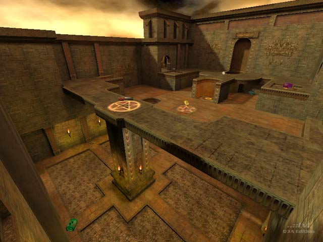
works best as a tdm for me. once you set up control of regen/ya area, you can also access the quad room too. the rl/ya area is the weaker of the two areas but you do get a tele/medikit alternating spawn and slightly quicker access to the quad via the teleport. but another plasma or lg at the bottom would have help strengthen up this area a little more. the lack of clear los moving into this area does aid in defence because the opposing team will likely be entering with a hitscan but the regen area has better access to health. The rl ammo clip also could have been moved into the rl area (down and back to the teleport) to allow the team controlling this area to spam the bounce pads and entrances more thoroughly. But the placement of gh and armour shards in the corridors leading in was a thoughtful touch. I think the level as a whole has a rather tried-and-true tdm design to it. And the respawn times for the power-ups allow plenty of opportunity for either team to gain the upper hand when they spawn. But usually the team that does so will grab them both. The proximity and connection between areas reminds me a lot of Corrosion by Phantazm.
Edited 9 minutes after the original posting.
Agree (2) or Disagree (0)
ResidentSCUM
unregistered
#11 29 Jun 2001
Fine use of the standard id textures, I don't believe there is a better example. I really enjoyed the bots play on this map. Great job, but you already know that.
Agree (0) or Disagree (0)
park
unregistered
#10 22 Jun 2001
I think it is with the newer q3map that comes with gtkr 1.1
You could make blocksize really small..like 128 or 256 units which would basically end up acting as if you put a lattice of cubiod hint brushes all across your level :) But that would be redundancy and creating more work for vis. Not usefull except for some weird exteme situations, since proper hinting will do better anyway.
Like you said, the level lends itself to some lines of sight and openness.
Agree (0) or Disagree (0)
Anwulf
unregistered
#9 22 Jun 2001
When I was beta testing the map someone said something about the 1024 blocks. Probably of questionable value.
Hinting helped a bit, but the nature of the level is such that there's not a lot you can do on that score.
I didn't know you could change the blocksize from the worldspawn - unless this is a gtk thing since I've stayed with Q3R.
Agree (0) or Disagree (0)
park
unregistered
#8 21 Jun 2001
Hrmm..mabye I misunderstood this..
how would the 1024 blocksize affect your level? All it does is make some brush splits (thus portals) where the blocks are. Especially since one can take control of vis with proper hint brush/structural brush placement..
Besides, you can change blocksize in the worldspawn enitity...
or mabye I misunderstood your post..??
Agree (0) or Disagree (0)
Anwulf
unregistered
#7 19 Jun 2001
Thanks Gonnakillya. I consider that fine praise indeed coming from you. Yeah I know about the framerate drop. Bloody nuisance. Needed to be more void between the two halves of the level. Probably also needed to pay more attention to the 1024 blocks.
Agree (0) or Disagree (0)
GONNAKILLYA!
unregistered
#6 19 Jun 2001
Wicked, wicked map!
I never get tired of playing this level, well done.
I've noticed the framerate can drop in some areas but that's a small nitpick on a terrific map.
Way to go Anwulf!!
Agree (0) or Disagree (0)
Anwulf
unregistered
#5 18 Jun 2001
Sorry about the double post. Twitchy finger I'm afraid.
Agree (0) or Disagree (0)
Anwulf
unregistered
#4 18 Jun 2001
Hannibal, that's at least the second or third time someone's made a comment like that about the map. I'm flattered by the comparison. :)
q3freak, there are some texture alignment problems because of some doorways in the northern area of the map. If there is any z-fighting, I'll want to know about it.
Agree (0) or Disagree (0)
Anwulf
unregistered
#3 18 Jun 2001
Hannibal, that's at least the second or third time someone's made a comment like that about the map. I'm flattered by the comparison. :)
q3freak, there are some texture alignment problems because of some doorways in the northern area of the map. If there is any z-fighting, I'll want to know about it.
Agree (0) or Disagree (0)
q3freak
unregistered
#2 18 Jun 2001
Solid map with a lot of curved brushes. Cannot see any errors on textures, overlapping...
Good work.
Agree (0) or Disagree (0)
hannibal
unregistered
#1 17 Jun 2001
This is about as good a neo-classic Id-Q3 FFA map as you'll find. I never grow tired of the traditional styling when it is pulled off this well. Great map.
Agree (1) or Disagree (0)

