**Preview only**
Be sure to submit your comment
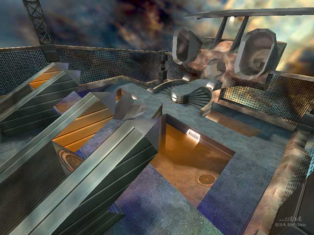
Those textures on the metal walls (shown in screenshot) are better for underwater atmospheres because of the wavy look.
Agree (1) or Disagree (0)
Chicken-Smoker
unregistered
#17 22 Mar 2002
You're all a bunch of homos and fags... no, sorry, just kidding..... lol ! This level is quite cool because it's very different ! good one binaryshi!
Agree (0) or Disagree (0)
Binaryshi
unregistered
#16 14 Feb 2001
"If an ammo pak were tucked away...", thanks for that line,
I'll consider that next time and make it even better =)
Agree (0) or Disagree (0)
Qu3BuS
unregistered
#15 12 Feb 2001
I am far from an expert (or great player for that matter) but my friend and I did log about an hour on the map... :) I found that I had some success playing "keep away" with the RL either after his spawn or if he ran out of ammo. If an ammo pak were tucked away somewhere else, it would have kept me "honest". Even as it stands we really enjoyed the map (as you can tell)...
Agree (0) or Disagree (0)
Binaryshi
unregistered
#14 12 Feb 2001
I don't know everything about item placement. My thoughts about it are still too limited to make perfect decisions for every situation. Then also comes the variety in player opinions, taste, preferences and playerload, and then its up to having developed a sence or feel for these things. I consider myself very fresh at these things and I wish (impatiently) to know completely what I am doing all of the time =).
What are your thoughts about difference in clustering the the RL + Ammo and spreading it a little over the layout? I figured that in a small fast paced level like this it doesn't make a big difference because you can get to each location in no time.
Agree (0) or Disagree (0)
Qu3BuS
unregistered
#13 12 Feb 2001
I played some "1 on 1" LAN games on the weekend and was pleasantly surprised. I expected to get bored quickly but we really didn't. There doesn't seem to be anywhere to go and yet there is... :)
I'm probably showing my ignorance here but I'm curious about Binaryshi's decision to "cluster" the RL and all it's ammo? I rocket jump to a railgun on the jet's tail would be cool...
Agree (0) or Disagree (0)
Binaryshi
unregistered
#12 10 Feb 2001
Think, I'll add a huge rocket to fly you out of the level's solar system =)
Agree (0) or Disagree (0)
[D^2]Blofeld
unregistered
#11 09 Feb 2001
The idea is nice, but not boiled down -I think-
Skip the fence, I like shooting people to a suiside....
Add The rail (down in the centre)
Stretch the map in the jump-pad->pipe direction (thus increasing the flightpath)to compensate for the raigun.
Let the env.cube spin, to make the players sick :P
Yellow dust in a blue/gray enviroment? make it at least white. or add more yellow licht (from 1 direction)
But these notes are all suggestions, so do as you please:)
What does the crowd think of mine suggestions?
-BF-
Agree (0) or Disagree (0)
elvis
unregistered
#10 03 Feb 2001
phat brush work..
i love those tunnels gonna byte them.. for an idea i got..
as soon as i figure out how to make em
eheh
everythings been said bout this one..
i agree its too small and not much to do
though its mad fuCKIN FUN!!!!
thats all that matters
right... fun and some obstacales to do some strafe jumping and or trick double jumping.. isnt that all one can ask for in a great map????
sorry but this one doesnt have it all. no rail bah for jousting bah
Agree (0) or Disagree (0)
Q-Fraggel
unregistered
#9 01 Feb 2001
Had very much fun on this one :)
Agree (0) or Disagree (0)
Killer
unregistered
#8 01 Feb 2001
Very cool map, Binaryshi. Most of the things are already said. But, I think you have to make it a little bigger. Voor de rest eruuug goed.
Agree (0) or Disagree (0)
Binaryshi
unregistered
#6 31 Jan 2001
Thank you for your comments...
I just try building what I think looks good and is fun to play in, then I share it with you guys. I hope one day to get the inspiration to make maps that hold an answer to anyone's deathmatch needs at the same time...that would be great, if such a map excist...(?)but I like to speculate it excists.=)
But what's already great to know is that there are a couple of you that have enjoyed the experience like I did when first play testing it, and so it communicates...hello there!=)
You're actually flying half of the time...and the bots being stuck on the jumppads was done on purpose. It would have been a bug to me if that was all they did, but they don't. Up there Deamia gets pretty violent when flying from left to right repeadedly and hard to kill also,
and in those situation its up to your timing to jump the other jumppad to meet eachother at the highest point (like knights with their lance on their horses in the middle ages=), and try shooting her out of the sky. Its a pretty funny and spectacular situation in the gameplay I think...
Agree (0) or Disagree (0)
Niptlar
unregistered
#5 31 Jan 2001
I think Tig and Mandog pretty much said it already. The brush work is great just like in Binaryshi's last level (Shortcircuit), but there just isn't much to do. I don't even remember seeing this map in beta anywhere. :/
Agree (1) or Disagree (0)
Deathmonger
unregistered
#4 31 Jan 2001
Some points are fun, but nothing else. The chutes are cool. Sadly, this map is nothing else that something to laugh with for a few minutes.
Agree (0) or Disagree (0)
Jalebi
unregistered
#3 31 Jan 2001
I was laughing so much playing this, for a small map its got so much in it and is a breath of fresh air. CPM 1 vs 1 ? I think so !!!
Agree (0) or Disagree (1)
Scampie
unregistered
#2 30 Jan 2001
Truly cool stuff done in this map. The multicolored bubble jumpers were a cool effect. Too bad this wasn't UT and you could've made the sky seem to fly by (accually, you probably could to an effect like that... think I'll experiment with it...). The gameplay was pretty fun 1on1. I thought it would be far too cramped, but lots of cool tricks and stuff and you've got yourself a good match. I only wish there was more to the map.
Lots of nice brush work, I'm very impressed by his curved tubes.
Now, that said, there are a few bad points to the map that are even more appearent due to the size of the map. Bots get stuck on the lower jumppads to shoot you at the other (as said by Tigger). The lights shinging down have a square volumetric light effect, but the lights are round. Looks 'funky'. The jumppads that shoot you toward the curved tunnels could've been textured better.
Just minor things truefully, but look larger when you look at the map as a whole.
Agree (0) or Disagree (0)
nunuk
unregistered
#1 30 Jan 2001
wow bin!
your brush work is truly amazing...those chrome tunnels are your personnal trademarks...very nice.
Agree (0) or Disagree (0)

