**Preview only**
Be sure to submit your comment
placing shaft, YA and RL in the same place is not good idea. (
Agree (0) or Disagree (0)
Pretty good for it's time!
Agree (1) or Disagree (0)
Good stuff
Agree (0) or Disagree (0)
Good style, but the textures aren't any good and the bots play pretty bad.
Agree (0) or Disagree (0)
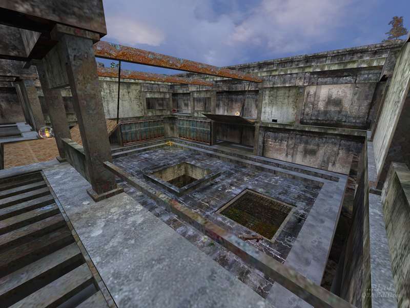
The custom textures create the industrial/military theme really well. Gameplay is really good as well as the lighting. The weapon placement is good and the rail gun is put in a nice place. Bots play really well.
I quite like the handrails and the two towers which one has a mega health and the other you get spawned on. The armor shards do give away your position but can also give away your opponents position.
I had fun playing the map G A Z E B O, 9.5/10.
PaN61
Edited: 28 Mar 2010 AEST
Agree (1) or Disagree (0)
Lima_Bravo
unregistered
#12 25 Apr 2001
Yes, after reading the comments below and downloading I found this map quite refreshing & interesting. Good gameplay ..
In a word - NICE.
Author got a website ?
I'd like to give it a vote of 9.5, seems I cannot so I gets the BIG 10 points..
Agree (1) or Disagree (0)
gorilla
unregistered
#11 22 Jan 2001
Yeah, I enjoy this map a lot. I've played it about 20+ times now and it's definitely one I'll be keeping in rotation. The layout's simple but strong, and the colors are solid. Bots work really well.
I download a lot of Quake 3 maps and this one stands on it's own and has identity (no matter how many nights it took).
Great job GAZEBO.
Agree (0) or Disagree (0)
G A Z E B O
unregistered
#10 12 Dec 2000
Well, I'm glad some of you figured out that this was not a "standard" Q3A map; there are plenty enough of'em out there, and frankly, I find the idiom pretty claustrophobic.
I hope to make the time to finish up some of the other levels that I have kicking around in '01; it sounds like there is enough interest in this style. I did send this one out to "test the waters," so to speak.
And for those of you who can't get enough of my ranting, do read the design notes that are included in the archive ;-)
PS Yes, there are a couple of bugs in this map. Gosh, how did that happen? It's not like I don't drink enough coffee... Anyway, there is a 1.02 version on the plate that'll get sent up here when I get a chance. Thanks for all the feedback, folks!
love + rockets,
G A Z E B O
Agree (0) or Disagree (0)
Quazi
unregistered
#9 08 Dec 2000
Reminds me of Dead Simple! ..and anything that reminds me of the old days deserves a 10!
It also reminds me of the black & white NIN video of "We're in this Together"...
Agree (0) or Disagree (0)
excessus
unregistered
#8 08 Dec 2000
This one has a different feeling, which is great, but also plays a lot of different than the rest of the Q3 levels, which is also great for a change. I would also like to see a derivative work for this one since I really liked this Half-lifeish feeling. Good work, mate.
Gave it a 10.
Agree (0) or Disagree (0)
RRRÕÕÕAAARRR
unregistered
#7 06 Dec 2000
Actually I was going to slag this one off, but I've just read that it was one night's work, and now I haven't got the heart! The textures are lovely, but I'd like to see a BIG industrial level using these...
Agree (0) or Disagree (0)
Hi-C
unregistered
#6 05 Dec 2000
Wow, this is shockingly good for one night's work.
I dare the author to spend two. ;)
The textures are nothing short of ideal -- this, and not the glossy polished cartoony textures of Quake 3, suggests "death" match to me.
Agree (0) or Disagree (0)
Goblin King
unregistered
#5 05 Dec 2000
Nice design and layout...
Definately worth downloading for LAN play...
Agree (0) or Disagree (0)
ResidentSCUM
unregistered
#4 04 Dec 2000
This is different, very nice theme and texturing, couple of brush overlaps. I liked the feel of the map had quite a bit of fun Tourney Style. I would certainly like to see this style developed quite a bit more. It seems we are getting a few more industrial themes recently and with nice asthetics (spelling?). Hope this trend continues.
Agree (0) or Disagree (0)
G A Z E B O
unregistered
#3 03 Dec 2000
Thanks for the 411, Tig. I did build this in one night, which is all the time I could spare, and that put something of a lid on the amount of tweaking I was able to do. This of course is no excuse for poor triangle management, but I figured that if I came in with less or at worst the same speeds T4 no-one would care too much.
C'est la vie. Oh, the shame of it ;-)
Oh, and by the way, I did use a lot of detail brushes. I think part of the problem is that when I designed this, I assumed that I could use hint brushes much as UT uses zones, but of course this is not all the way it works. I did spend a fair bit of time with the Portal Viewer plug-in as my main tool, but, again, time was head-down against me.
love + rockets,
G A Z E B O
Agree (0) or Disagree (0)
Tigger-oN
unregistered
#2 03 Dec 2000
You may want to use the
create detail (CTRL+M) in Q3Radiant on selected brushes assist with the r_speeds as well as how the level is cut up by the BSP process. A r_showtris 1 will show you the current polygon layout, this could be a lot clean with careful work.
And yer, thge hand rails do stop the rockets, porperly what I had a problem with :]
Oh yer... whine away... I don't mind one bit!
Agree (0) or Disagree (0)
G A Z E B O
unregistered
#1 03 Dec 2000
Not to take issue with the esteemed Tigger-oN or his crew... but I like hand rails ;-)
Just kidding. They're there to mess up the rocket launcher, which otherwise tended to dominate the map. And I did try to keep the r_speeds to no worse than any of the retail Q3A maps... but then I only tested it on a couple of systems, and there may be some setups that bring out design issues that I was not able to test adequately.
Whine whine whine :-P
love + rockets,
G A Z E B O
Agree (0) or Disagree (0)

