Be sure to submit your comment
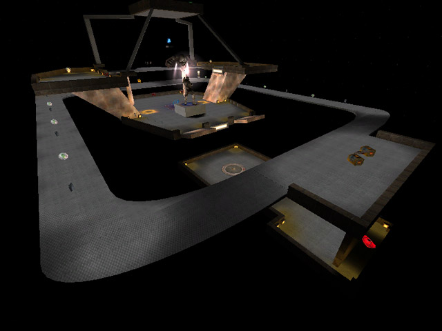
It might have just been my setup, but there were missing textures all over (particularly the 'sloping' walls). This lead to an immediate dislike as I couldn't see where the teleporters were... which leads to the next problem.
Invisible teleporters....grrrr :-(
(not just due to missing textures)
Nice idea having a teleport room (the RL), but then teleporting the player back out with no visual warning is bad enough, but the exit location led to even more confusion - especially as it appeared to be inside the disproportionatly large floating light.
I liked the statue though, shame it's not solid.
The overall layout seemed nice but I think it was simply a bit too busy - like you've tried to cram as much in as possible. I liked the outer walkways, but I didn't see much point in going all that way round just for small armour + 5 healths.
From what I could tell, the layout itself is quite nice, but we didn't play for very long because the invisible teleporters and missing textures really got me annoyed..
Possibly make the inner area a bit bigger, or maybe just clearer.
Only having a few choice items and smaller scenery would probably make this a much better map.
I hope you have another go Ray, (either a reworking or a new map), because there are some parts of this map that show potential.
