Added 12 Apr, 2000
Comments
Add a comment
**Preview only**
Be sure to submit your comment
Be sure to submit your comment
Submitting comment...
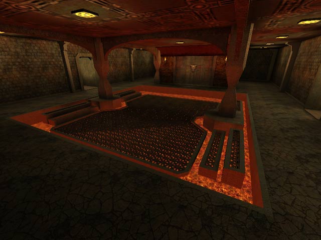
Interesting desing of map. Connectivity is quite decent. RG room and placement is very nice. This might be fun for a few rounds.
Agree (1) or Disagree (0)
Download NOW just to look at. I found myself frag many times looking at the textures and archetecture. I tip my hat to Daemonik for making a level that has more colors than just red yellow and black. Blue theres a color you just dont see in quake. Great acheltecture can be seen in the room with the rail gun..or just look up in the room with the rocket launcher is. Its nice that level makers are really trying to make there levels look good. But i must agree with Tig.. the game flow is a bit relaxed. The portal room helps but it just isnt enough. Game play brings this beauty down. But I now am a fan of Daemonik's eye candy. KEEP IT comming!! 6/10 sorry but game play is what makes a game.
Agree (0) or Disagree (0)
