Added 09 Mar, 2000
Comments
Add a comment
**Preview only**
Be sure to submit your comment
Be sure to submit your comment
Submitting comment...
room of skeletons is funny!! :P
Edited: 06 Nov 2010 AEST
Edited: 06 Nov 2010 AEST
Agree (0) or Disagree (0)
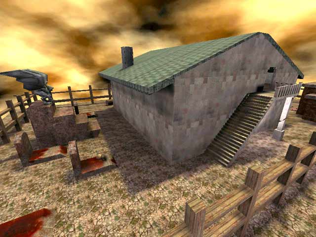
Oh, my mistake. I guess the author couldn't use actual player body models sitting down on a chair so he just did that. The house could have had more rooms though.
Agree (0) or Disagree (0)
Maybe The Room full of skeletons was meant to be a joke on Monty Python.
Agree (0) or Disagree (0)
Hm funneh.. I had this map in my baseq3 folder, and never played it... 0_°..
ok I'll be back =)
/me waves at a future nb in the year 2005
Agree (0) or Disagree (0)
Not all that bad. It's nice to see some different style. :)
The house could have been a little biger. ;)
Agree (0) or Disagree (0)
For crap's sake there are too many lazy people out there. Is it reall ALL that hard to type /map bn in the console? Besides that is the only way to change maps when you are running a server unless you are using a scripted order. Fine it could show up in the menu for adding bots and stuff it would be easier but still, taking away -2 for this fact and -1 for leaks and textures? Thats nuts, it loses more points for something that has nothing to do with the real map than a very important often overlooked problem with many custom maps. And BTW you are among the few Q3 players out there who hasn't gotten the Threewave pack yet, thats where the textures are as Tig said and IMHO Threewave has got to be the single map pack that mappers can safely assume people will have and thus not include extra textures from it in their own map .pk3's. Right well Octovus "Over and Out" =)
Agree (0) or Disagree (0)
-2 for not appearing in menu
-1 for missing textures/leaks
-1 for layout, simple too small in all places. I love the decorations. This could become a really neat map.
Agree (0) or Disagree (0)
Right, I think people would get what I meant but: after I say "map pack of three CTF levels.", all futher comments are about Very Bad Neibors, not Threewave CTF. =)
Agree (0) or Disagree (0)
Hehe...Jim: it's on fileplanet and it is a kick-ass map pack of three CTF levels. It was pretty good, if I had spent longer on it I might have noticed "lots of little errors" but when you are fraggin away you don't tend to notic such things. =) I think it might have been really cool to add a basement to the house and maybe to make the wishing well lead somewhere. (as in swimming out the bottom and being in another room or something of the sort) The regeneration was hard to get at as Yunfat said. The above idea might eliminate this problem. Other than that nice, and the "poor souls" were a nice touch. Keep 'em coming!
Happy Fraggin! Octovus
(Oh yeah, 7 outa 10)
Agree (0) or Disagree (0)
"need ThreeWave CTF for a few textures" what is ThreeWave CTF and were can I get it?
Agree (0) or Disagree (0)
Could have used a bit more work.
I did get a kick out of the fact that the regen respawned in the wishing well.
By the way, those poor souls sitting at the dinner table, what were they eating anyway?
Agree (1) or Disagree (0)
Good 1v1 map. Although I must admit a there are not enough respawn points. Its a little to easy to just park it on the RL and wait for enemies to come to you. I like the simple layout of this map. A nice big house surrounded with a big square yard. My biggest gripe is the regeration in the water well, which is too hard to retrieve without getting plugged.
Agree (0) or Disagree (0)
