Added 29 Mar, 2003
Comments
Add a comment
**Preview only**
Be sure to submit your comment
Be sure to submit your comment
Submitting comment...
Ok map. Too horizontal all the way. Items are scarce.
Agree (0) or Disagree (0)
@FragTastic: It kind of reminds me of the map that have a deathmatch with Akasha on for Unreal Tournament 3 :D
Agree (0) or Disagree (0)
Kind of reminds me of a map from UT2004. I loved the Gameplay but the lighting was very weak I have to say. 7/10
Agree (0) or Disagree (0)
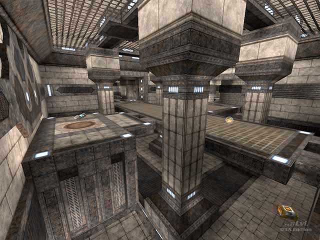
Despite the uninventive lighting (seems like a lot of ambient light was used - and the map has a bit of a monotone feel as a result) the map looks great. Good use of the textures, amethyst7 has a great eye for aesthetics - both in terms of architecture and coloring.
The map is a bit flat! The higher levels are not much higher than the lower ones - i think if this map was 50% taller it would be significantly better.
Good use of plat's also.
8/10
Agree (0) or Disagree (0)
bit too open repetitive looking, hard to navigate because of that IMHO. Could have done with more defining areas like the PG area. Texturing is quite well done, lighting's not bad but a too bright and boring. 7/10.
Agree (0) or Disagree (0)
Is it just me or does this level feel a bit "sparse"? I found that there seemed to be a lot of long treks, requiring lots of strafe jumping, to get weapon and ammo pick ups if you just spawned, and then once you were loaded up, finding an ememy to use them on seemed to take awhile.
I love the look of the map; the colours and texture set look fantastic, but the gameplay didn't seem as exciting as the looks. Again, maybe just me. Anybody else?
Agree (1) or Disagree (0)
