**Preview only**
Be sure to submit your comment
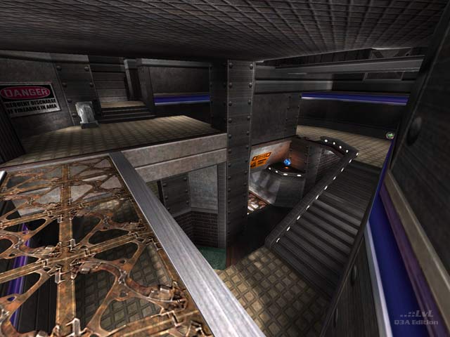
I thought this was an interesting mish-mash of looks and I liked it overall. The reviewer wasn't kidding about the map being tight though. It's so much so that its going to dictate gameplay quite a bit... but it also somehow feels like it works here. Can't really put my finger on why since I usually like a bit more room to move, but gameplay still feels "good". I thought item placement was fine, but I'm not totally sure about the MH. I think it should be included but where its at currently is a little easy to snag without much drama. Something comparable to the RA pickup area probably would have served well for it.
Agree (1) or Disagree (0)
Hmm I think this map would be good with NoGhost mod. Because the map is big and wide open spaced and needs something fun added to it.
Agree (0) or Disagree (0)
dOOd
unregistered
#10 19 Nov 2005
This map is way cool; I like the broken jump pad effect!
Agree (0) or Disagree (0)
nitin
unregistered
#9 26 Nov 2002
wviperw,
the RA area is indeed the best looking part but IMHO it doesnt fit in with the rest of the map at all. Thematic consistency or a them in general seems to be missing. And I think the whole just because it plays good so you cant crit the visuals approach is garbage. There's a lot of criticism when it's done vice versa so why cant it be done this way around as well. I think the ultimate aim is obviously to create both a good looking and playing map.
Anyway, that's just IMHO and isnt all directed at pjw's map.
Agree (0) or Disagree (0)
StormShadow
unregistered
#8 26 Nov 2002
The looks are fine, although not stunnning... however i didnt especially like the gameplay, i thought a lot of the areas were a bit too tight. Just a personal pet peeve.. but maybe thats from playing too much rocket arena, and having so much space to manuever around.
Well done map though, its good to see more mappers going for gameplay over aesthetics.
I would give it a 7.5 but i cant, so ill be nice and round up to 8 :P
GJ
Agree (0) or Disagree (0)
pjw
unregistered
#7 25 Nov 2002
Thanks for the feedback guys! I'm glad I seem to be improving in the gameplay department. A good chunk of that is thanks to the beta testers, but I seem to be getting a better.
Dale (and anyone else who doesn't like the style), thank you for the feedback as well--I appreciate the honesty. I'd worry more if it was consistent, but it doesn't seem to be, which leaves me falling back to "can't please everyone". I like it. shrug
wviperw, you didn't know about Tig's crack habit? Just send him a little "package". :)
Agree (0) or Disagree (0)
Mr. President
unregistered
#6 25 Nov 2002
Not every map has to look like the ceiling of the Sistine Chapel, and pjw has at any rate achieved a simple, coherent, and subtly original aesthetic in this, his latest (and, IMHO, probably greatest) effort. Hell, I love the way it looks. Given the superior layout and ass-whomping gameplay, moreover, I think you have to be a bit of a lemon-sucker to dwell on its (invisible-to-me) visual faults.
Agree (0) or Disagree (0)
wviperw
unregistered
#5 24 Nov 2002
whats up w/ people dissing the maps visuals? Have you even cared to walk outside to the lava area? Its got pretty sweet visuals IMO. And theres plenty of shaders @ work in the map too if thats your fancy.
Plus, the gameplay more than makes up for any "poor" looks it might have. :)
Agree (0) or Disagree (0)
Dale
unregistered
#4 24 Nov 2002
It has nice layout and plays good. But visuals are rather poor.
Low detail, shoddy look, inconsistency. And no-taste shiny shaders.
Dont want to offend you, but your building manner and style leaves a lot to be desired.
Agree (0) or Disagree (0)
nitin
unregistered
#3 23 Nov 2002
the gameplay and the layout own, even better than the original q2 map. One of the best tourney maps ever.
The looks arent too my taste, but pjw already knows that becuase I've said that like a 100 times now :)
Agree (0) or Disagree (0)
Pure Imaginary
unregistered
#2 23 Nov 2002
It's pjw's greatest map ever. Download it!
Agree (0) or Disagree (0)
wviperw
unregistered
#1 23 Nov 2002
hey, hey. Nice one pjw. What I want to know is how you got them to review your map so fast. Money? Women? Cute fuzzy little kitties? Whatever it is, I need to be using it for my maps. :D
Agree (0) or Disagree (0)

