Added 19 Oct, 2001
Comments
Add a comment
**Preview only**
Be sure to submit your comment
Be sure to submit your comment
Submitting comment...
Hmm Sorry to say this but this map is not my kinda map..
- Lagging
- Textures Need Fixing
- Expand
Agree (0) or Disagree (0)
Seems funny to say that it's only an "enjoyable deatmatch layout"...what do you want, after all? :-p Though I can see complaints about the bright lighting and a few other things fun is what its all about in the end.
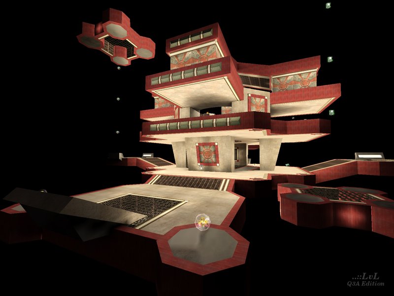
Some places of the map were pretty disused. For instance, there wasn't much point in using the launchpad to middle platform to bouncepad to top combination when you could just hop on a single bouncepad instead. Placing a weapon on the two non-moving seperate platforms might have given incentive to go there (I hope that made sense; it should if you've played the map).
There was way too much health on one of the floors, with all told about 300 health right there (one 50 behind each pillar and two 50s in the centre). Still, its a fun map that's worth giving a go. Nice to see the floating platform ideas from q3dm19 revisited :-)
-Octovus
P.S. 8 from me.
Agree (0) or Disagree (0)
