Map-Center's Redux 1
Map-Center's Redux 1 by Various
Comments
Add a comment
avatar
**Preview only**
Be sure to submit your comment
Formatting help
Submit
Preview
Cancel
Submitting comment...
avatar
HelterSkeleton Rep. 7566
#21   35 hrs ago
@Obsessed :
@HelterSkeleton : My next comment is just questions regarding the project itself: how many maps did people have to choose from? And could everyone pick the same map or was...

ah yes, thank you! I thought it looked familiar. I would have seen that movie in the eighties. While I get the twist on the reference, and appreciate the intent, you may want to rethink the potential reading of "redskin".
Agree (0) or Disagree (0)
avatar
Obsessed Rep. 756
#20   49 hrs ago
@Foo :
@Obsessed : @sedawkgrep : @fKd : @sedawkgrep : vedq3dm1_remix is REALLY dark for me. Significantly darker than the attached shots in the media tab. See here: imgur.com/a/vJyBaTl...

unfortunately, I can’t say much about it, but for me (and anyone who maps for CNQ3), it’s inevitable. I’m grateful for the compilation string and I’ll definitely try it. I’m afraid it won’t win almost twofold brightness difference between q3e and cnq3. but it’s worth a try! =)
Agree (0) or Disagree (0)
avatar
Tig Rep. 2962
#19   59 hrs ago
Update Obsessed has update the PK3 for "I like your hair long". As of this post, the download has the updated version.
Agree (2) or Disagree (0)
avatar
Foo Rep. 579
#18   61 hrs ago
@Obsessed :
@sedawkgrep : @fKd : @sedawkgrep : vedq3dm1_remix is REALLY dark for me. Significantly darker than the attached shots in the media tab. See here: imgur.com/a/vJyBaTl Anyone...

Your maps are often darker than most when viewed on a high-graphics configuration (For example, the Blood Run pack). When I play them with other people sometimes they comment on it. There's nothing visually wrong, it's just a notch or two darker than they're accustomed to. Easy to work around by bumping r_gamma up a few levels, so we just do that in-game.

It's been a while since I compiled anything for release but I remember having to increase brightness a lot to get external lightmaps looking right on my own maps. My compile line for light was:

-light -threads 22 -extlmhacksize 512 -patchshadows -dirty -brightness 1.8 -bounce 8 -fastbounce -samples 3

Edited 9.82 hours after the original posting.
Agree (1) or Disagree (0)
avatar
Obsessed Rep. 756
#17   71 hrs ago
@sedawkgrep :
@fKd : @sedawkgrep : vedq3dm1_remix is REALLY dark for me. Significantly darker than the attached shots in the media tab. See here: imgur.com/a/vJyBaTl Anyone know why this...

no one could give me the certain answer atm what would help. the map looks dark in q3arena too. but as a simple man I personally could offer you to use cnq3 client with vq3 physics - it has very clear visual comparing with q3arena! :D and cpma bots are beyond praise!
Agree (0) or Disagree (0)
avatar
Obsessed Rep. 756
#16   3 days ago
@sedawkgrep :
vedq3dm1_remix is REALLY dark for me. Significantly darker than the attached shots in the media tab. See here: imgur.com/a/vJyBaTl Anyone know why this might be? Edited...

hi! =) I guess that's because I'm using cnq3 client (shipping with cpma mod). I can try to compile the map's light w/o ext lightmaps - maybe it could help. and to put both new versions into a separate .pk3 if it's important for you =) I couldn't believe there still are people who care so much about Q3 levels ))) I'll ask Tig.
Edited 1.02 minutes after the original posting.
Edited 1.52 minutes after the original posting.
Agree (1) or Disagree (0)
avatar
Obsessed Rep. 756
#15   3 days ago
@HelterSkeleton :
My next comment is just questions regarding the project itself: how many maps did people have to choose from? And could everyone pick the same map or was it a first in best...

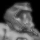
hi, Mr.Skeleton =) this dude is an indian "Nobody" from 1995 Dead Man movie by Jim Jarmusch. this is the frame right after he cuts one white man's throat =) I just tried to play out the map name differently than in relation to girls ))
yes maybe I left too many ammo. but I'm not so good in aiming and use very cool cpma bots so maybe it wasn't enough rockets/bullets for me :(
Agree (1) or Disagree (0)
avatar
sedawkgrep Rep. 3497
#14   4 days ago
@HelterSkeleton :
@sedawkgrep : vedq3dm1_remix is REALLY dark for me. Significantly darker than the attached shots in the media tab. See here: imgur.com/a/vJyBaTl Anyone know why this might...

I switched to vertex and it lost all character/atmosphere. Everything was bright...which of course is better for gaming but looks ..old.
Agree (1) or Disagree (0)
avatar
sedawkgrep Rep. 3497
#13   4 days ago
@fKd :
@sedawkgrep : vedq3dm1_remix is REALLY dark for me. Significantly darker than the attached shots in the media tab. See here: imgur.com/a/vJyBaTl Anyone know why this might...

I'm using quake3e. Linux/AMD video.
Edited 12.98 minutes after the original posting.
Agree (0) or Disagree (0)
avatar
HelterSkeleton Rep. 7566
#12   7 days ago
@fKd :
@HelterSkeleton : @fKd : @HelterSkeleton : OK I'm gonna break this down in two parts and two comments. Clearly Obsessed worked the hardest on connectivity and gameplay, and...

np
Agree (0) or Disagree (0)
avatar
fKd Rep. 451
#11   7 days ago
@HelterSkeleton :
@fKd : @HelterSkeleton : OK I'm gonna break this down in two parts and two comments. Clearly Obsessed worked the hardest on connectivity and gameplay, and it shows - esp with...

Hahaha, I was just joking around. Trust me, no offense was taken.
Agree (0) or Disagree (0)
avatar
HelterSkeleton Rep. 7566
#10   8 days ago
@sedawkgrep :
@HelterSkeleton : My next comment is just questions regarding the project itself: how many maps did people have to choose from? And could everyone pick the same map or was...

thanks
Agree (0) or Disagree (0)
avatar
HelterSkeleton Rep. 7566
#9   8 days ago
@sedawkgrep :
vedq3dm1_remix is REALLY dark for me. Significantly darker than the attached shots in the media tab. See here: imgur.com/a/vJyBaTl Anyone know why this might be? Edited...

are you using dynamic lighting with vertex instead of lightmap?
Edited 41.67 minutes after the original posting.

Agree (0) or Disagree (0)
avatar
HelterSkeleton Rep. 7566
#8   8 days ago
@fKd :
@HelterSkeleton : OK I'm gonna break this down in two parts and two comments. Clearly Obsessed worked the hardest on connectivity and gameplay, and it shows - esp with the...

Hi, so you are Iori? Well clearly, as acknowledged in the readme, the original layout is solid and not much need for change. clearly it worked. It was simply a comment where 2 things stood out as noteworthy in my mind and should not be about taking anything away from the other authors. My personal opinion: clearly we already know you have the skills as evidenced by your other work. And you have already received a glowing review from me on another level, so I don't quite understand why you are feling like you are "missing out". But honestly: the "slime" at the bottom looks fantastic. But I'd like to see something that lets you get out of it. Set higher, for a RJ out? An area at the bottom with a teleporter? Standard damage slime? Given the size of the maps and the design, they are all pretty much tourney-sized, and would have liked to have seen tourney treatment: a different item layout that removes the quad and replaces it with something else (MH?) and put the RG where the MH is etc. This is just a general (and I think fair) criticism of the original map. And while not the primary brief, there was obviously some leeway here that other authors took advantage of given that it was a "jam" and not a competition and this level seems to call for it. As someone who was not an organiser and simply a player, I assess individual levels with respect to the entire map database and a scoring system I worked hard to develop over time that tries to take into consideration all of the factors of a custom level to try and be as fair as possible to all the elements. My standards of judgement would be completely different under different circumstances (say were I employed as a judge for a competition with a set rule set and criteria). I feel like my omission on this occasion may have been taken way to personally. It was in no way intended to be taken personally. But regarding that particular map itself - honestly I think it could have been tweaked for tourney and that would have been an interesting take. And while I have some ideas floating in my head, I feel like i have really missed the boat to learn an editor and making maps. I just feel like I am way to old to learn new tricks now. But I would like to think I would be open to suggestions, assistance and expertise even if I felt like I didn't always have to take them on board :/
Edited 1.37 hours after the original posting.
Agree (0) or Disagree (0)
avatar
Foo Rep. 579
#7   8 days ago
Man those are really nice enhancements! Good job sticking so faithfully to the original layouts, too.
Agree (2) or Disagree (0)
avatar
fKd Rep. 451
#6   8 days ago
@sedawkgrep :
vedq3dm1_remix is REALLY dark for me. Significantly darker than the attached shots in the media tab. See here: imgur.com/a/vJyBaTl Anyone know why this might be? Edited...

What exe are you using?
Agree (0) or Disagree (0)
avatar
fKd Rep. 451
#5   8 days ago
@HelterSkeleton :
OK I'm gonna break this down in two parts and two comments. Clearly Obsessed worked the hardest on connectivity and gameplay, and it shows - esp with the inclusion of a better...

What about my map :(
Thanks to everyone for taking part and big ups to Tig and Sprony for running the event.
Edited 1.4 minutes after the original posting.
Agree (2) or Disagree (0)
avatar
sedawkgrep Rep. 3497
#4   8 days ago
vedq3dm1_remix is REALLY dark for me. Significantly darker than the attached shots in the media tab. See here:
imgur.com/a/vJyBaTl
Anyone know why this might be?
Edited 2.42 minutes after the original posting.
Agree (0) or Disagree (0)
avatar
sedawkgrep Rep. 3497
#3   8 days ago
@HelterSkeleton :
My next comment is just questions regarding the project itself: how many maps did people have to choose from? And could everyone pick the same map or was it a first in best...

Theere's a thread in the forum about this project:

lvlworld.com/thread/583/0

I just noticed that the map for vedq3dm1_remix is actually called "ved", and also contains the original map in the pk3. A curious decision which I wish the author did not do.

Just an FYI for those who either want to avoid having duplicates, or are maintaining a database of maps like I am.
Edited 52.15 minutes after the original posting.

Agree (2) or Disagree (0)
avatar
HelterSkeleton Rep. 7566
#2   8 days ago
My next comment is just questions regarding the project itself: how many maps did people have to choose from? And could everyone pick the same map or was it a first in best dressed situation? Also forgive my ignorance: but who is the face of the dude in red around the map by Obsessed? I was hoping i might see it the read me, but no. Also, I am assuming that if there were contributors who missed the deadline, we might see some stand-alone release in the near future?
Agree (0) or Disagree (0)
avatar
HelterSkeleton Rep. 7566
#1   8 days ago
OK I'm gonna break this down in two parts and two comments. Clearly Obsessed worked the hardest on connectivity and gameplay, and it shows - esp with the inclusion of a better item spread, and the window to sg and jumps up through the level around the gl. And a shout out to DetroHogga because he clearly went for the map that was going to be the biggest challenge (the original just doesn't have the same layout as the other two). Also "Movement is Life". While perhaps metaphysically true this is certainly the mantra for fans of Quake. Here's my minor niggle: given you'd already gone to all the trouble to tweak the levels, why leave the double ammos next to each other in the vedder, or all the bots in the arena file for the mcbugzz when it is clearly too small for that many players. Not a big deal, just a little puzzled as to why those little details were left when so much effort was put into everything else?
Agree (1) or Disagree (0)
Clear