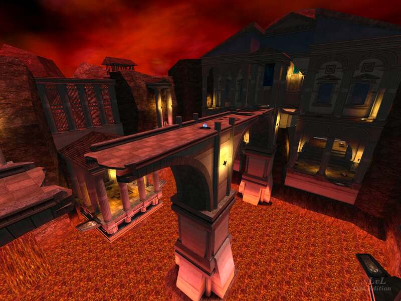
Neoclassical architecture, a massive lava pool with a broken bridge over it, a series of jump pads and missing textures make this an interesting level at first glance. Ultimately, the game play is let down by the ease of the flag capture.
Why are the missing textures interesting? Well, I was lead down a rabbit hole trying to find the origins of this map, looking for the textures. The release could have been designed for an unfinished mod, but I was unable to find anything solid to back this up.
The massive central body is just too open and too quick to navigate from base to base. A tighter arena like area, a low bridge that exposed the players crossing it more, a shorter distance with a few obstacles to prevent a straight run would have all helped the game mechanics.
The flag rooms are mostly successful but even these could have done with a little more game play focused architecture. Instead, the author has focused on trying to capture Neoclassicism.
The author has release a somewhat more successful DM focused release called Carnage grounds which includes a lot of the same great architectural features. It is unclear which release was first out the door or if they were released at the same time.
A map that is big on structure and visuals, great brushwork establishing the architectural look but let down by missing game play.
Ranked: 3 out of 5 (2 votes)
Download: Contrast Carnage by *ZeRo*
