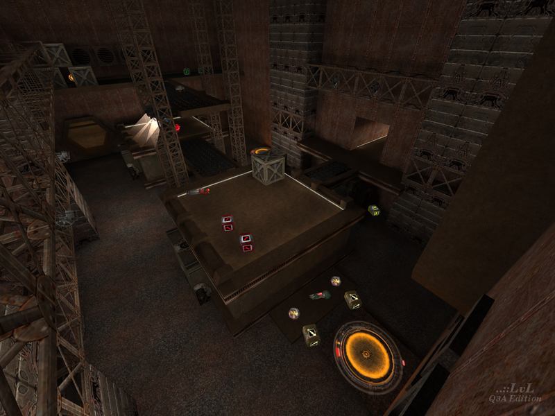
We're looking at a room-corridor-room map here. The layout is four large rooms in a square pattern, each with one hallway connecting to the two adjacent rooms. A bit simple, but I guess that makes the map impossible to get lost in. There are two large rooms with some verticality and lots of weapons. These rooms tend to host large free-for-alls. The other two rooms are small and flat. Since they don't have as many desirable items in them, there are a lot of 1v1 encounters here.
This keeps the gameplay somewhat varied, but the rooms are not breaking any grounds in level design. The small rooms are completely flat and empty save for a prop or two to hide behind. And the larger rooms often devolve into cramped spam-fests. These rooms set the maximum player count at four. Any more and it is just a continuous bloodbath without any space to breathe.
Bots mostly play fine, but they seem to avoid the large room with the Shot Gun.
Aesthetics-wise, the map looks good. It remind's me of the condemned testing area from Portal 2 with the tall rooms, flaming barrels, and rusted metal. Each room has a distinct look and layout to make them stand out from each other. The "security system" that spews out grenades when someone takes the Quad Damage was a neat touch, but I don't think anyone ever actually died from it.
If you are not turned off by the simplistic layout, give it a try and you might have some fun. But this map will not impress anyone looking for something more interesting and refined.
Reviewed by ZungryWare
Ranked: 2.8 out of 5 (3 votes)
Download: Acidburn by Scorn
