Be sure to submit your comment
Looking back at the map you're right about the corridors, they were abit of an after thought as I was concentrating on getting the central area to play the way I wanted it to. Getting the bots to play this map without drowning all the time was the biggest headache, in the future I intend to spend more time on the textureing and tunnel design to finish off the map.
Cheers
But it's a true statement, I mean you can look at say most of Nunuk's maps. Main stream space maps. Or Lunaran's Coriolis Storm. Those are things that everyone bascially likes, if you discount the odd person (odd as in very few not as in weird :-) ). Everyone should get them. This is more a thing a few people will enjoy. There I go defending Lvl for something that way2kool knew anyways, so :-p
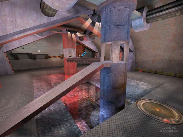
It's interesting; way too cramped. I was trying to decide between this and Rotten and I decided this was the one to dl. The central are is very interesting, but I was wondering why there is not a water texture in the water. It feels like one is flying.
I don't honestly know whether there could have been one, but if there could...it would help with the feeling of disorientation I got.
I liked the water tunnels to the weapons (RG, PG). The whole lift and slime thing for the rail made it feel a bit like singleplayer. If someone really wanted the rail to themselves, it'd be easy to hold that spot with an RL (boing, into the slime you go).
Over all, interesting ideas, but make those corridors bigger! The looks individually aren't bad, but they really don't fit together. Concentrating on a theme (such as the tech one in the corridor leading to the railgun room and the railgun room itself) would have helped it come together. Keep working on it!
-Octovus
P.S. Gave it a 6 :-) I do love innovation, but it's got to work well. For instance, getting the medikit and the red armor was really awkward since battles were always going on there.
"Some will enjoy this more than others."
um, ..... duh?
