Added 21 Apr, 2001
Comments
Add a comment
**Preview only**
Be sure to submit your comment
Be sure to submit your comment
Submitting comment...
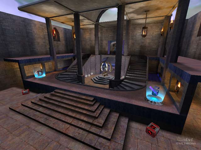
if you are referring to the dark/nolit area behind the jumpad-thats kinda of a hidin spot-----but i will fix the grate thingy--i fell thru once but checked the map and the clip brush was fine-will try extending it thru the connecting brushes-----email me and i will get back to you---thanks
Agree (0) or Disagree (0)
I thought the map was decent. I was getting ready to use it on my server then I found a few what I believe to be bugs. One was an unfinished part of the map (located by the jumpads). And also there is a grate above the entrance to the flag room where you can fall through the floor. Fix these and I think it is a pretty good map!
Agree (0) or Disagree (0)
Vr|ebag: I have reviewed your map for Missionpack Maps...but it hasn't been posted yet cuz we're trying to finish a batch of reviews before posting any. Eventually it will be posted here:
Go to the site if you like, click on the reviews page, and you can email me any questions you have from there.
Agree (0) or Disagree (0)
hi-thanks for the review-was ment to be small style map-guess i went too small--i would like to know if the map has potential if widened and water removed-i guess basically keep bases and redo middle. All comments welcomed-including bad-which will prob be majority. The only way better your map is to know all the flaws-and thats my goal--GOOD MAPS
thanks again
Agree (0) or Disagree (0)
Just too cramped...and all the midfield water adds no strategy.
Agree (0) or Disagree (0)
