Be sure to submit your comment
Hmm... Maybe I should ask Tigger for a job here at ..::lvl?
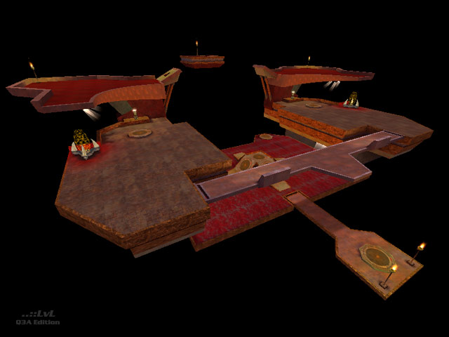
As to the map: it plays well enough with Q3's standard bots (my Internet connection doesn't allow me enough time to play multi properly.) No real problems, but the bots are kinda predictable, as they almost always go straight for the RA.
The Gothic textures don't really suit the map's architecture, but maybe it's just 'cos I'm used to id's version. In any case, I think that the textures you chose were pretty distracting.
Go check out Firestarter's "Red Light District" (filename is map-fs_dm2.zip) - it's mainly red, like your level, but the light is not as intense and distracting.
The layout of the map itself was kinda wierd, esp. the jump to the RA; again, tho', this may be just 'cos so I'm used to the original. (I play DM17 a lot with Instagib.)
The vanilla version of your map seems to have really odd weapon selection: your readme says that it's meant for Instagib matches or (presumably vanilla) DM. Since the Instagib mod automatically removes all weapons on the map, why did you bother putting only RGs in in the DM version? I mean, if you didn't want to play Instagib with your map, you'd expect a few other weapons other than just the RG.
In my (admittedly limited) experience, Instagib players are rail junkies; ppl who aren't playing Instagib either: a) don't like using the RG; or b) like the RG, but want to try using other weapons in order to balance their skills.
Assuming all of that, your choice of weapons is, as I said earlier, confusing. A better idea would have been to keep DM17's original choice of RL, RG & SG; perhaps also including a GL on the upper platforms for variety.
Overall, I'd give this map a 6. It's not an "avoid at all costs" map; but neither is it an instant classic.
D0kt0r X: I'd recommend you work on your maps a bit more before releasing them. I realise that this was just a quick re-do of a classic (readme says a build time of "about 2 weeks of spare time"); but if you wish to release this map to a wider audience, you need to polish it a bit more to make it up to the standard of the other maps on |lvl|.
Thank you for your time.
Now, when I go looking for new maps to d/l, I try to find maps that are new, not just a re-hash of an existing level. If this had been a remake of, say, Q2DM1 (The Edge) for the Q3 engine, then I might try it. Or if it was a recreation of Q3DM17 for the Q2 engine, again, I might try it. (I actually have this map, altho' the Eraser bots don't play too good on it.)
Judging from the screenshot, this is merely a re-texture of Q3DM17, with RGs replacing all other weapons. The re-texturing, to me, is something really trivial: given a working knowledge of Radiant and some spare time, any newbie could do it.
Worse, tho', is the fact that your level is for the same game engine that the original was in. Meaning that all the game physics are going be the same, and that the level is going to play just like id's original.
Hence my original complaint: why should I waste bandwidth to d/l a level that plays the same as a level that I already have? There's nothing radically new here, just a new paint job, which I could have done myself if I had Radiant.
If you want my vote, D0kt0r X, then you're gonna have to offer me something more than just a new paint job.
My point: Try it with INSTAGIB and see if you like it and if you don't then it is fine with me but what use is a comment from anyone who hasn't tried the map?
I haven't d/led it yet, and can see no reason to either. Sounds like a waste of bandwidth to me. :(
