**Preview only**
Be sure to submit your comment
Timothy11 BlacK
unregistered
#9 19 Jan 2000
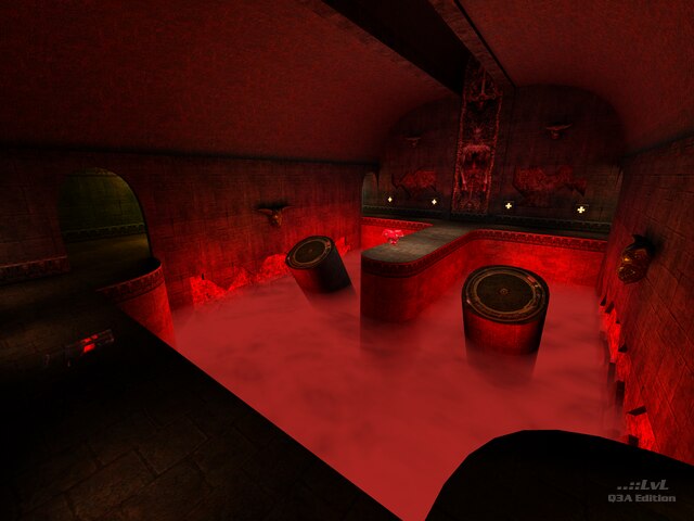
Kind of a crappy map!Some cool texture use,good item placement and texture alignment but other than that it was too forgetable!And what's up w/the two pads in the middle of the fog that are in awkward angles and spots...I found myself falling into the void every time I tried to execute a jump!The only thing I like about this map is it's gothy feel...bright maps suck quake shouldn't have a prozac theme to it!!!
Agree (0) or Disagree (0)
Partisan
unregistered
#8 18 Jan 2000
A few issues have cropped up:
As far as the "the map isn't loading" problem, make sure that you haven't overloaded your baseq3 folder with too many pk3's as it will clog up the loading proceedure somehow. If this happens to you, get rid of some of your less-favorite maps.
I have heard that some people are getting a big nasty grid texture instead of just a plain black texture when looking up at the ceiling above the rl. This occurs on some platforms and not others, depending most probably the video card used. All I can say is make sure your drivers are updated (and I will be sure to avoid any controversial textures in the feuture).
I get the desired black ceiling on my Athlon SDR Geforce... what about the rest of you?
Partisan
Agree (0) or Disagree (0)
cyberman
unregistered
#7 15 Jan 2000
it looks like a good map but someone tell me how come it doesn't load all the way. It's gets half way loading the map and then it kicks out to main menu.
Agree (0) or Disagree (0)
BSOD
unregistered
#6 15 Jan 2000
Surely, this is the best Q3 map for a present moment - deep, dark, really weird, still have a presure even with vertex lighting - a breathtaking place!
Agree (0) or Disagree (0)
tapped
unregistered
#5 15 Jan 2000
pretty damn nice... only things i didn't care for was 1) no way (that i could find) to get to the lower level from the top, aside from just jumping down, and 2) the room with the two pillars and with bounce pads on the ends... something just seemed kinda' weird with them... dunno what exactly, and 3) kinda' nit-picky, but the bounce pad that you hit just before you nab the quad, there's a funky error around it - dunno if it's lighting or what, but the wall behind it... the left side of the curve looks fine, but the right side of it doesn't meet properly with the back wall.
Agree (1) or Disagree (0)
Partisan
unregistered
#4 14 Jan 2000
If you are talking about the room with the RL, it is supposed to be tottaly black up there. I wanted to give the room a cavernus feel.
Oh yeah, to anyone whoever posts here, I think I am obligated:
"Thanks for taking an intrest in my map. It means a lot to me... etc."
Partisan
Agree (0) or Disagree (0)
Zeldrik
unregistered
#3 14 Jan 2000
very nice map lots of room
like the tight basement with the fog (good for frags)
one thing did anyone else have a missing texture on the ceiling
or is it just me?
Agree (0) or Disagree (0)
Navi
unregistered
#2 14 Jan 2000
BEST map I ever saw!!!!
COOOOL
Agree (0) or Disagree (0)
[ sno ]
unregistered
#1 13 Jan 2000
doesnt look to bad from the screenie..
i just wanted to say that..
..i posted th first comment!
heh heh..
Later :)
Agree (0) or Disagree (0)

