**Preview only**
Be sure to submit your comment
Awesome Skybox my friend :) I love this Space themed map. It contians everything a space map needs, bots, good gameplay, good structure & of course good environment and this map has it all. 8.5/10
Agree (0) or Disagree (0)
UT Player
unregistered
#21 17 Feb 2002
just because Rio doesn't like this map
Agree (0) or Disagree (0)
Snake
unregistered
#20 27 Feb 2001
kinda drab but nice walkway design
Agree (0) or Disagree (0)
Tyre
unregistered
#19 14 Jun 2000
Well, I like the sky here. It adds to the map a lot. Game play is quite fun, but the map's over-symmetrical for my taste. And the architecture is a bit spindly; if this were a plane it would be a BE2. One bot play issue: it seems to me that bots occasionally get stuck on the small platforms where the PGs are.
Agree (0) or Disagree (0)
[QR]Boner
unregistered
#18 11 Jun 2000
Hmmmmm,looks like I've started an intergalactic war with this one :)
Glad some of you like the map,but hey everyone's different and entitled to their opinions.
Cheers for all the feedback guys.
biscuit.man@virgin.net
Website:-
freespace.virgin.n...chie.wills/q2me
Agree (0) or Disagree (0)
BigFrickinGun
unregistered
#17 11 Jun 2000
.....nice to see everyone getting along.....
Anyway, cool map. I like the planet Saturn being there. It adds to the atmosphere. Bots like to fall off a lot, but hey, that makes it easier for me to win!
Agree (0) or Disagree (0)
Klingon St'n'cke
unregistered
#16 11 Jun 2000
For giving too high number of points to this map, you all have to clean my battlecruiser 'Steinecke'. From the outside. Without any spacesuit.
Agree (0) or Disagree (0)
Captain Kirk
unregistered
#15 10 Jun 2000
I like the sky but I'm not crazy about the colors used in it. It would have looked better if it would have used darker tones. The best space sky I've seen so far is in the newly released "Nebulosity" (spelling?). Excellent sky in that one.
I thought the map played pretty decently. I would have liked to see a personal teleporter in there somewhere.
I want to give it a 6.5 but I can't so I'll round up. 7
Agree (0) or Disagree (0)
Captain?
unregistered
#14 10 Jun 2000
Steinecke, you're going in the Brig permanently for calling me eccentric, or as you would put it 'excentric. At least I don't speak fluent Klingon, and follow William Shatner while he's on holiday.
Agree (0) or Disagree (0)
Steinecke
unregistered
#13 10 Jun 2000
Nice to see 'Babylon5' on the horizon. The 'sky' is ugly. Gameplay is really bad. Texturing is ugly. Better download something else, except you're a rather excentric Captain, or, -the best: your name is William Shatner
Agree (0) or Disagree (0)
Captain (Horatio) Chaos
unregistered
#12 10 Jun 2000
What was the Enterprise doing on the River Rhein?
'Space Confusion' is another map that I thought was quite innovative.
Agree (0) or Disagree (0)
Steinecke
unregistered
#11 10 Jun 2000
It was 1998 on a ship on the River Rhein, here in Germany. No convention.
If you're so interested in spacemaps, -try 'Space Confusion'.
Agree (0) or Disagree (0)
Captain (Horatio) Chaos
unregistered
#10 10 Jun 2000
Steinecke, I suppose you met him while attending one of those Star Trek conventions; and you call me strange!
Agree (0) or Disagree (0)
Steinecke
unregistered
#9 10 Jun 2000
I once met Captain Bill Shatner... -he's a little strange, too.
Agree (0) or Disagree (0)
Captain (Horatio) Chaos
unregistered
#8 10 Jun 2000
The reason I gave this map an eight is that the designer attempted to create something different, and avoided that most boring of skies 'the void', coupled with the fact that the arena is quite a good structure and plays ok. The innovation I was referring to was the custom space sky; there are too few of these in Q3. This is my opinion, and so it must be right,hehe!
Agree (0) or Disagree (0)
Blitzz
unregistered
#7 10 Jun 2000
RiO, it's n'est-ce pas =P
Learn your French =P
Agree (0) or Disagree (0)
Johnny Law
unregistered
#6 10 Jun 2000
Fun map in a rocket-arena-with-powerups sort of way. It's no good for traditional DM, but if you want to zone for a while and work on your railing while abusing some poor bot, this map fits the bill. It would be nice though if the bots didn't leap to their doom quite as much.
Also the bottom of the map needs a NoDrop zone, because it looks silly to have backpacks and weapons and stuff hovering in space down there.
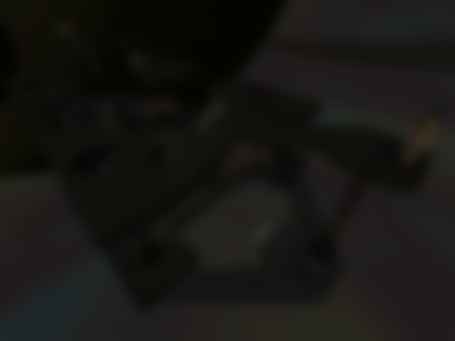
The sky texture is indeed purty. (BTW, since this is the "Titan" orbital platform, I'd assume that the planet in question in Saturn.) It's a shame that Q3 can't make the edges of skybox panels line up quite right. I hope they fix that (maybe in Team Arena?).
Agree (0) or Disagree (0)
RiO
unregistered
#5 10 Jun 2000
Captain - 8 for this map is a little over le top, nes pa? Stein is right again... what's 'innovative'. And if it didn't play fast enough, why did you give it an 8?
BTW Steinecke, what is your e-mail address? We should get in touch :>
Agree (0) or Disagree (0)
Captain (Horatio) Chaos
unregistered
#4 10 Jun 2000
Nice to see someone trying to create a custom space environment, rather than sticking to Id's ugly void background. In my opinion the sky might be improved if you chose a different colour for the large planet and satellite moon as the present choice just didn't work for me. Also in UT the planets have an illuminous ring surrounding them which adds to there appearance, consider implementing this. It would also be nice if you animated some object in your skys as this would enhance it's asthetic appeal and increase the sensation of fighting in a real place. For further inspiration on space settings, why don't you check out some pictures from the Hubble telescope as these are extremely impressive and may give you some ideas. By the way I did like your custom sky and only made these comments as I would like to see what else you could come up with.
With regard to the actual arena, I thought it looked above average and was quite well structured but didn't play fast enough for my liking, the inclusion of a few more well placed accelerator pads might help speed things up and improve the gameplay. The bounce pads looked ugly and I think custom ones, maybe Mr Clean's would look much better in such a futuristic setting.
These remarks are not meant as criticisms, just suggestions as I think the author certainly has potential, but as yet not fully realised. I hope you will keep making innovative maps as I am very interested to see what else you can create.
SCORE: 8
Agree (1) or Disagree (0)
LordLobo
unregistered
#3 10 Jun 2000
Fun deathmatch. Textures could use some work. Some minor technical glitches (like weapons remaining on the death-floor).
Agree (0) or Disagree (0)
magatsu
unregistered
#2 10 Jun 2000
had this map for some time now and plan on keeping it. the sky creates a good 'floating' illusion and the bots play well. (9)
Agree (0) or Disagree (0)
RiO
unregistered
#1 10 Jun 2000
Good Idea with the sky, but the way the .zip file extracts is annoying and the BFG is a 'real killer' as Tig would say....
Add to this to horrible symmetrical blob and wierd jump pads and you are not impressed.
Would have been 4/10, -1 for annoying .zip file. 3/10
Agree (0) or Disagree (0)
![Titan Orbital Platform by [QR]Boner](/levels/orbplat/orbplatlg.jpg "Titan Orbital Platform by [QR]Boner")