Added 25 Sep, 2023
Comments
Add a comment
**Preview only**
Be sure to submit your comment
Be sure to submit your comment
Submitting comment...
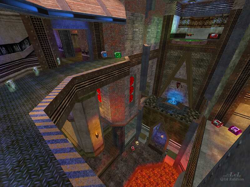
Agreed - this map is fuck ugly! It was always supposed to be a twist on the typical expected layouts of a map, with much more gimmicky sections than youd usually see. It started as a CA map, with a focus on verticality, but the more i worked on it, the more it felt like a FFA carnage map and so I made some of those more tight spaces. Was great fun making this one!
Agree (1) or Disagree (0)
