Added 16 Apr, 2015
Comments
Add a comment
**Preview only**
Be sure to submit your comment
Be sure to submit your comment
Submitting comment...
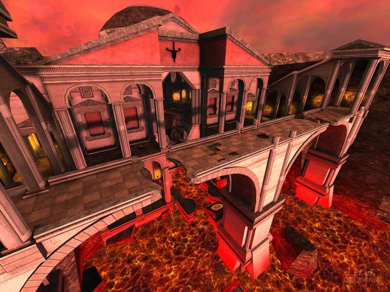
visually stunning with atmospheric lighting ZeRo's maps have largely been creative exercises. for vq3 I would certainly scale it down, but taken for what it is load it up for an excessive mod. a space map... only with lava!
Agree (1) or Disagree (0)
This map has a really nice and uncommon achitecture.
really nice!
really nice!
Agree (1) or Disagree (0)
The clouds, the soft lighting and the texturing of the hills were very good. The architectural and geographical layout, also very interesting and well executed. Some brushes were very basic, like the rocks in the river. But I guess thats not easy to make. The first thing that struck me when I entered was of a greek, or egyptian prehistoric place. I guess the lava gives it that barbaric flavor. If the lava and waterfalls were more lifelike I would have given it a 10/10. 8/10 :D
Agree (1) or Disagree (0)
I'm actually quite surprised at how vast this map is. It's so big! The hallways make me look so miniature lol but that's not the main point here. The architectural design in this map is spot on and I can clearly say that a lot of work has been put into this map seeing at how the outcome is really good. Keep on mapping ZeRo, I'm looking forward for more work from you!
Agree (1) or Disagree (0)
