**Preview only**
Be sure to submit your comment
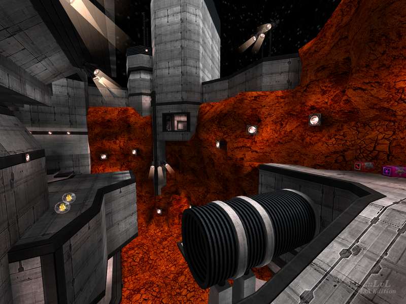
I almost forgot about this map until it got featured recently, which is an honor this map totally deserves. As AEon points out, the design is very unconventional and haphazard, but not in a bad way by any means. The layout is "organic" in the sense of how it flows and connects back on itself so satisfyingly, with so many nooks and crannies to explore that the map feels like one hardcore playground; fun to navigate even if you're not fighting other players. The texturing is minimalist, but more than held up by the complex geometry (I really like the contrast between the cold, gray metal and the red dirt outside). There are a few long lines of sight, but it's never a big problem because the nature of the map's design gives the player plenty of opportunities for cover. Graviton is a fascinating and captivating piece of work, and 100% a must-play.
Agree (1) or Disagree (0)
I agree with AEon in his comment about the architecture. But its absolutely well done.
In some maps I have my problems with this cement texture because of its sterile touch. Here in contrast it fits perfectly to the atmosphere and the overall texturing and color selection.
The map plays nice with Instagib-Rail.
Agree (2) or Disagree (0)
I love the redness of the rocks. 9/10.
Agree (0) or Disagree (0)
Refella seems to be a architectural anarchist with this map, very deconstructionist... and these are all good things because they make the map unique. I love the orange-red rock contrasting with the mostly angled grey concrete architecture. Extremely creative use of geometry, that may at first glance suggest this map is unplayable, far be it from it. The author did some "wild" things, but held back just enough to keep the map playable for vQ3 bots. Mapping excellence, that is :)
Looking into the textures folder, it is uncanny how few textures this map is made up of. Clearly one of my favs, from a style standpoint. Oh, and be sure to turn up the music, the very heavy metal sound puts the player on edge to "frag"!
Edited: 23 Aug 2009 AEST
Agree (2) or Disagree (0)
db
unregistered
#12 23 May 2009
An interesting map. Quite different experience. Felt cramped though inside the buildings with no sideways room to move. But definitely worth the download and playing.
Agree (0) or Disagree (0)
It's a shame this guy never made cpma maps as they all have excellent potential in this area. there are a few areas where you can unintentionally use cpma (like up to the mh) but otherwise i was just going round thinking "now only if this spot here had..." etc. The soundtrack was a bit at odds with the map (it could have done with something a little more electronic/avant garde) i dont know what it is that always sees heavymetal being the norm as the soundtrack for killing when often it is the peculiarities of movement and architecture that appeals.
Edited: 17 Aug 2008 AEST
Edited 3958.28 days after the original posting.
Agree (0) or Disagree (0)
redfella
unregistered
#10 27 Jan 2005
:O Thanks man!
Agree (0) or Disagree (0)
J2KoOl63
unregistered
#9 20 Jan 2005
redfella, you have made a fantastic map. First, item placement was good. Second, the music fits the map. Lighting was pretty good. Bots played really well. The best part of the map was the gameplay. I loved jumping around to all these different parts of the map and the design. There is not much to say about this map except that it is a brilliant. Welcome to the 10/10 group!
10/10
-J2KoOl63
Agree (0) or Disagree (0)
redfella
unregistered
#8 15 Jan 2005
Fakeeye: thats the first Ive ever heard of anything like that. It went through 2 betas and many tests, and that issue never came up. Not sure whats happening there.
Agree (0) or Disagree (0)
Fakeeye
unregistered
#7 12 Jan 2005
my PC hangs up, when I start it :D, it does not happen in any other map, just this one :D
Agree (0) or Disagree (0)
gast
unregistered
#6 25 Dec 2004
hmm the map and the music is pretty good.but in multyplayer the server goes down.wye?????????
Agree (0) or Disagree (0)
redfella
unregistered
#5 21 Dec 2004
just curious, but what does "kll" mean?
Agree (0) or Disagree (0)
wgh
unregistered
#4 20 Dec 2004
kll
Agree (0) or Disagree (0)
nitin
unregistered
#3 17 Dec 2004
nice map, your best so far.
It did really feel like an alien place with all those weird angles and strange colored rocks outside. Nicely lit too, but a more moody lighting scheme would have enhanced the alien atmosphere. Ambient sounds should also have been included.
Brushwork, whilst being odd and well constructed, still felt a bit cluttery in parts of the map as if you were trying too hard to do odd stuff. More importantly, the cluttery nature of the brushwork got in the way of gameplay in the map as it hindered movement in quite a few areas.
Still, a good map.
7.5/10
Agree (0) or Disagree (0)
redfella
unregistered
#2 17 Dec 2004
Thanks man. Lucky for you I'm in the process of wrapping up a non-base map. :)
Agree (0) or Disagree (0)
{DEMO}LITION
unregistered
#1 17 Dec 2004
Great work redfella. It would be cool now if you produced a non-base map for your next project to get some mix :)
Agree (0) or Disagree (0)

