Added 29 Jul, 2004
Comments
Add a comment
**Preview only**
Be sure to submit your comment
Be sure to submit your comment
Submitting comment...
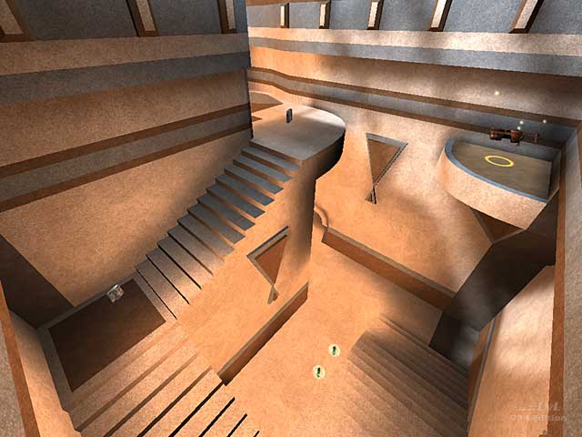
Love the clean design in my favorite material sandstone, but what really turns me off (irony) is the almost full bright lighting in most areas of the map. Turning down the light by 20% would IMO really helped.
As was pointed out the map is very cramped, navigating it thus requires mandatory skill. My limited level of skill may well be getting in the way here, but I kept getting snagged and stuck. The low ceilings, IMO, would have been nicer if they had been 50-100% higher. The gameflow did not feel natural, I never felt like getting anywhere, more like repeatedly arriving somewhere. Again, my biased opinion.
I would have loved a version of the map, with nicer lighting, less cramped, more generous layout, and more connected paths.
Agree (0) or Disagree (0)
This map could have used more textures mabee a bitmore powerups. Good job though the gameplay is smooth and fun. Keep up the variety!
Agree (0) or Disagree (0)
Many thanks. Actually this was quite an old map, rebuilt as I had messed up the scale somewhat originally. Mr Lake, I think you make a valid point...as my understanding of gameplay has developed this is an area that I have been trying to tighten up on in my newest stuff. J2Ko0l63...trying to make maps just a little differently is what I have been aiming for, I am glad you like it. With luck as I go on playability improves also.
Agree (0) or Disagree (0)
Your designs have been getting more and more polished. I think one of the areas of your design that needs improvemnet is making the centerpiece of your levels not only look cool, but be completely functional to gameplay. You have lots of scenic bits here and there, but they're just pictures on the wall - nothing you really interact with or use to your advantage.
Despite that, your sense of lighting and color are great, it shows in this map. I may not keep it on my harddrive forever, but for now it's enjoyable and that's what really matters.
Agree (0) or Disagree (0)
dONKEY has been creative for his last few maps. He always seems to make maps that are different from others, and that is what makes his maps special. All of Me is a small little level that was meant for tourney but I play DM. Bots navigate well, but they are actually easy. This isn't really a jumper type map but hey, it was meant for tourney. Great job dONKEY! 7/10
-J2KoOl63
Agree (0) or Disagree (0)
