**Preview only**
Be sure to submit your comment
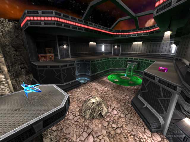
I very much enjoy this map. Just the amazing size and eye-popping details keeps me playing this map over and over again. Now I can finally enjoy some real good matches, whether with bots or humans. Overall a perfect gem to add to your Q3A map collection.
Agree (1) or Disagree (0)
Very good map :)
Edited: 25 Feb 2012 AEST
Agree (0) or Disagree (0)
I really liked the theme here: A large asteroid with an industrial complex built on it. I would have preferred a mining facility because it would make more sense, but then the author is in charge of that. Some of the textures remind me of some Jedi Outcast/Jedi Academy custom maps with similar themes
As for the gameplay, I felt that some areas could have been a bit more smaller or compact to make sense, or play better. Too many wide open areas and not enough hallways.
Edited 1338.72 days after the original posting.
Agree (0) or Disagree (0)
Back then we actually beta tested this map at quake3world. Re-playing the map now brings back memories. I love the attention to detail, the wonderful texture placement and architecture.
But alas, the arenas still feel very disconnected due the the "excessive" amount of sliding doors (that I personally hate in MP maps). Anyway, alone for the visuals the map should be checked out.
Agree (2) or Disagree (0)
Mark
unregistered
#10 13 Jul 2008
This plays really well in cpma too
Agree (0) or Disagree (0)
GTG
unregistered
#9 11 Nov 2004
This map is so amazing, it actually caused me to vote on LVL for the first time in a couple years. Great job.
Agree (0) or Disagree (0)
Madan
unregistered
#8 28 Feb 2004
Gorgeous. Unique. Visceral. 10/10.
Agree (0) or Disagree (0)
Gazoline
unregistered
#7 07 Dec 2003
Beautiful, crisp visuals. If you were to retain the quad room, then alter the rest of the map layout around it successfully, it would be a fantastic map. Can't wait for your next one!
Agree (0) or Disagree (0)
nitin
unregistered
#6 21 Nov 2003
have the same thoughts as tig and stormshadow regarding gameplay/layout.
Visuals are very pretty especially considering framerates. Nothing too fancy but extremely well put together.
Agree (0) or Disagree (0)
ALMighty
unregistered
#5 21 Nov 2003
Thanks for the comment StormShadow! Nice to hear it's being played! :)
Agree (0) or Disagree (0)
StormShadow
unregistered
#4 21 Nov 2003
That last comment was from me
Agree (0) or Disagree (0)
not entered
unregistered
#3 21 Nov 2003
I agree with tig about the layout, it just seems like all the rooms are too seperate from one another, and dont really flow as well as they could. I think it could had a 3rd or 4th level in some of the rooms as well, to increase the vertical action. But again, this would have required almost a complete reconstruction, which probably wouldnt have been worth it :)
Other than that, I like the map quite a lot, its on rotation over at BG, and despite the stuff i pointed out as flaws, its still very fun to play.
7/10
Agree (0) or Disagree (0)
ALMighty
unregistered
#2 21 Nov 2003
That's exactly what I thought you would say, Tig. My beta testers also said the same thing. It suffers from the room-hall-room syndrome, which is a result of bad planning.
I would rather start a new map than redoing this one, because it would require me to redesign almost the whole map and I just don't think that would be worth it. I better just start a new map and plan the layout more next time.
Thanks for the review Bizkit! Although you were probably too nice on it! ;)
Agree (0) or Disagree (0)
Tig
unregistered
#1 21 Nov 2003
This is a well-made level with nice visuals and theme, but the layout is simply not working for me. Each area is similar and self-contained (due to the coridors and doors), which does lead to some good action, but becomes a little dull after a short while. A lot more varity and less doorways could have improved this map a lot.
Agree (1) or Disagree (0)

