Be sure to submit your comment
Edited 2.55 minutes after the original posting.
First- the acchitecture was way too simple, and the layout was not good. Too many long corridors and dead ends.
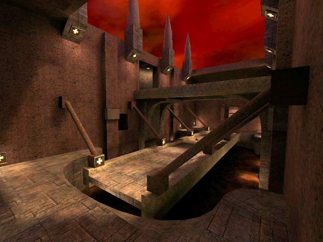
The map was just way too rough, for example, stairs were just a bunch of stacked blocks, with no side-runners. Ornamentation was limited to not much beyond what is seen in the screenshot.
Item placement was erratic- the BFG was far too easy to get, and in one area there were no less than six 50 healths.
And one thing I must mention- I know the Q3A world is just a fictional one, but it just looks too odd when a bridge is supported lego-block fashion like in the screenshot, where there is no bracket at the end of the supports or anything that remotely resembles something that supports the weight of the bridge. Even a huge nut underneath each support end would give me the impression that there was a giant bolt holding it up or something....
