Added 30 Nov, 2002
Comments
Add a comment
**Preview only**
Be sure to submit your comment
Be sure to submit your comment
Submitting comment...
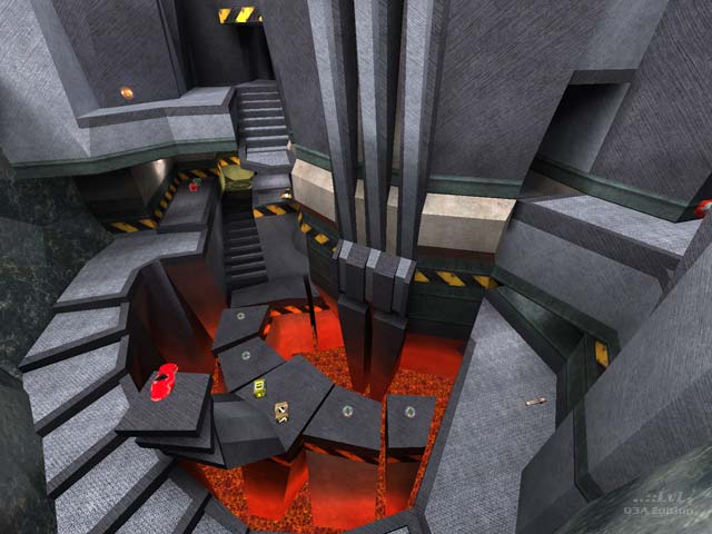
Really interesting map that sort of lets you in on how you're supposed to move around it the more you play it. I like the jumps the MH and RA power ups encouraged the player to do as well. I wasn't sure about this one at the beginning of a match, but by the end I found myself having a lot of fun here. Per my usual mantra with bots... I'd say more is better. I added Doom and Keel to the mix along side the suggested Xaero which seemed to give me the pace I wanted. All seemed to play the map pretty well.
Agree (1) or Disagree (0)
Top-notch gameplay, interesting and different layout, and clean and simple looks. Very nice map.
// Grudge
Agree (0) or Disagree (0)
I really thought I'd hate this map... but playing a few bots I realized it was a fun ass map! Though the bots seem to be doomed to fall in the lava constantly.
love the RA placement!
Agree (0) or Disagree (0)
I like this map a lot--great fun to play, and a very cool aesthetic going on here.
I think I might even like it better than Vacant--I'll have to play it a bit more to see--but that's saying a lot.
Agree (0) or Disagree (0)
It's a nice map... Lots of jump pads, though... but the item placements are brilliant nonetheless...
But the teleporter design is... well... wrong, for some reason...
Agree (0) or Disagree (0)
excellent layout, the gameplay is brilliant. Texturing is allright, though some of the tex chocies are questionable (a few areas with high res detailed textures coupled with low detail textures right next to them, breaking the flow). Lighting's pretty good though a bit overly bright, but most DM maps suffer from this. The 2d architecture is a bit boring but I guess it's not too much of a distraction in such a fast map anyway. Nice work, I like it a lot better than wvwq3dm5
Agree (0) or Disagree (0)
