Added 28 Oct, 2002
Comments
Add a comment

**Preview only**
Be sure to submit your comment
Be sure to submit your comment
Submitting comment...

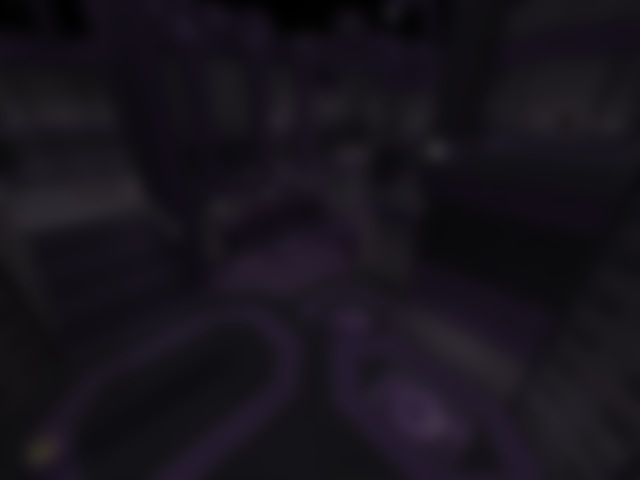
I really like the purple, it makes me feel pleasant playing the map. I love the purple glass in the floor, it sets off some beauty looking through the glass at the stars in space.
Really good map amethyst7.
9.5/10
PaN61
Agree (0) or Disagree (0)
Well, i'm a newby and everything, got Quake III gold the other day because I was bored with Unreal Tournament 2004. To make a long and pointless story short, I downloaded most of the custom maps available for Quake III and I have to say that this is an amazing map. The layout is great, easy to learn yet enough to keep me busy for a while. And there are two shot guns.... Actually a lot of DM maps have two shotguns placed in them, some even have two rocket launchers. I love the purple, it's different and gives the level a very clean look. I especially love the purple glass in the floor so you can see the stars below, that's a really nice touch. Bots play really well. Lastly, the are no problems with the map, no over lapping textures, no missing textures, and no bot errors (that i'm aware of). That alone is enough to make a map for Quake III one of the best in all of the maps i've downloaded (220 to be exact) because it has absolutly nothing wrong with it. Its just a matter of personal preference. This one is probably in my top three favorites. MORE!
Edited: 26.Feb.2006 03:08 UTC
Agree (0) or Disagree (0)
Sweet map. Fast gameplay and nice visuals. The brushwork is simplistic and well done. I didn't mind the purple at all as I thought it was subdued enough to not be overbearing.
Hell of a map. I gave it a 9.
Agree (0) or Disagree (0)
found the coloring an eyesore. the purple is cool but there's way too much of it. the overall textures and brush design is also way too repetitive. it's like walking through a maze of mirrors. no need for 2 shotguns. no need for 2 bouncepads leading to the plasma rifle (i think it was that). personally, i dont like picking up small armor here and there. you have 1 piece here, walk around, pick another... sorry, its annoying. you could probably add more connecting vertical too. despite those comments, you are definately on a pro level. i just dont like the layout/design of this. too boring to look at. spice it up!
Agree (0) or Disagree (0)
Hmm... yer right, i can't find the file either. You can get it directly from my site if you need to.
Thanks for all the compliments everybody. AS for it being on servers, kilnet is running it in the loop now.
-ame7
Agree (0) or Disagree (0)
Was a fun map with the bots on nightmare.
Color was different but pleasing.
Color was different but pleasing.
Not great bt would be nice to see in some servers.
Agree (0) or Disagree (0)
What a great map! The bots play it well and they are deadly. Constant action and fun. Great job!
Agree (0) or Disagree (0)
nice theme, the purple is pulled off extremely well. Some nice brushwork too but the lighting's a little flat.
Layout wise, too flat and horizontal for my liking, the scale seems lightly off too. Perhaps the second floor needed to be higher up a little bit.
nice work overall, a 7.5 IMHO.
Agree (0) or Disagree (0)