Be sure to submit your comment
However, this map is worth hanging onto.
(I am glad I don't have to try to be "constructive" HERE. ;0)
The gameplay is pretty good, tossed in a few bots and was horribly lost for most of it but I'm sure I'm just an idiot and can't find my way around. :)
Keep up the good work.
I found the weapon placement ok, but why Yellow armor and shards side by side?
If you like this map, also try Nihil´s older maps (similar theme):
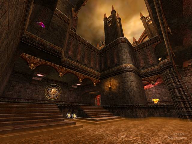
This is the sort of map I always thought I'd be playing when I first bought Q3A. I love anything that looks like this. A lot of the textures in there are new to me, and I especially like the arched overhangs.
It's true, though, the item placement is not brilliant. It's like one arty mapper built the level then handed it over to somone else to put the weapons in.
As for the plinth in the lava lake, I think it's just there to oppose the diagonally symmetrical facade. I get the feeling that area should be clipped off overhead. It's not too hard to rocket jump on it, but if it's supposed to be a player-carrying feature then why is the whole top surface one sheet of rust? Could have been meant for a powerup, then changed later on...?
Generally, it's one of the best thumping gothic FFA levels I've seen. If you don't like this sort of map, then why the fk do play Quake 3?
The gameplay is pretty good, though there is some clipped weirdness. Focus tends to be on the connecting passage between the rocket launcher tunnel and the central quad atrium, especially with bots, with some areas getting left out. But if it's nothing new, it's still worth checking out. The new teleporters (well, it's really just a new texture/shader) are quite nice :-)
A 7 from me, simply because it's nothing new, but it's nothing new done well :-)
-Octovus
