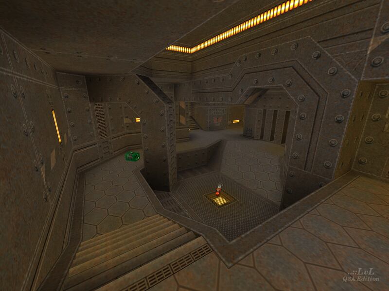
A map made by Fjoggs for the now-defunct levelsource.com's gameplay competition. As the author admits, the map is "very boxy" and states having only "spent 2 days on it". Hearing that a map was built in such a short period of time probably does not inspire confidence at first, but after actually trying it out, one could certainly do much worse.
Evillair's eQ2 texture pack is quite fitting, given the simplistic and highly angular geometry, free of patches or curves. The textures and brushwork combine to form a clean, minimalist map free of overly-distracting details. My main complaint would be the lighting, being rather flat throughout with little contrast. The exclusive use of yellow light trims and panels - which would give Deus Ex: Human Revolution a run for its money - certainly is not helping matters either. Some cool blue or violet lighting to help offset and oppose the warmth of the yellow would make the map a bit easier on the eyes and more visually appealing. Also, the elevator looks a little strange, using a teleporter texture and being impossibly thin, the latter of which can be noticed by observing someone else use the lift.
The layout is somewhat of a corridor-fest, with a lot of the action taking place on a single floor in enclosed spaces, give or take some minor height variation with stairs. There are two areas in the map that are a bit more open and offer some much-needed vertical gameplay and breathing room - one with a RL, and the other the RG on an elevated platform. Down from the RG towards the back is a RA with a teleporter that takes the player into the main RL room, adjacent to a GL. There's a pair of bars observing the main RL, next to the RG doors, that can be used to take peek shots behind some cover.
With all the hallways in the map, lots of frags will be made during split-second meet-ups within them, with the SG and splash damage based weapons proving to be dominating. The more open RG room encourages more tactical battles, not only because of the multiple routes coming in through different heights, but also because it serves as the buffer zone into the RA corridor. There is a back passage with the YA and a secondary RL to give players some stack, but it is also easily intercepted, especially if using the jump pad.
Many players will enjoy the close-quarters fighting this map provides, but do pay mind to the ceilings in the hallways - many of them slope along with the floor, and if you do not pre-emptively crouch beforehand you will end up hitting your head. Since this is usually avoidable because of crouching, this is not really an issue and could be argued as a way to punish players who are too reckless with their movement. A more pressing problem would be the doors - they are a tad slow and more than once have I smacked right into them - this is a bigger issue with the PG door, since it is located in a long tunnel, whereas the RG door is typically approached around the corner. Also, for some reason, these doors can not be opened with your weapons, so do not think you can get them to open for you ahead of time by firing a few bullets. I do not know why this was done but in my opinion it only serves to impede the map's flow, and not for the better. This map also has a very low number of spawns at only 5, so spawnkilling will be rampant.
Given the restrictions this map was developed under, I ca not be too hard on it, especially considering that it was Fjogg's first-ever release. They have clearly learned valuable lessons from this map and went on to create releases with much stronger gameplay and aesthetics, but as a starting point, it is hardly offensive. Probably not a keeper, but worth a shot.
Reviewed by EmeraldTiger
Ranked: 3.8 out of 5 (4 votes)
Download: Fair and Square by Fjoggs
