Be sure to submit your comment
btw i dont blame you for leaving those clip boxes out. i regret fixing that kind of thing sometimes since you normally findout after you think youve done your final compile. i really like the design and ill give you an 8
btw i think in future you should try to improve the connectivity of your maps.. dificult but worth it. nice map }:>
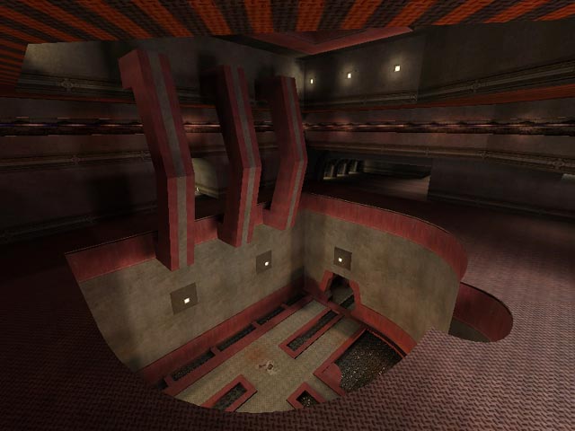
The simple texture scheme belies a very cool design that sort of creeps on you, like Ikka's first Q3 map did.
The deathpit's actually cool, as is the dark sky, and both suggest fathomless distances.
But it's the sense that you're in some workable place which separates this one from the pack. Scale, proportion, and great lighting all add to the look of cool pragmatism.
Clip brushes? Yeah, it could use some. That, for my money, was the only drawback. Nice job!
