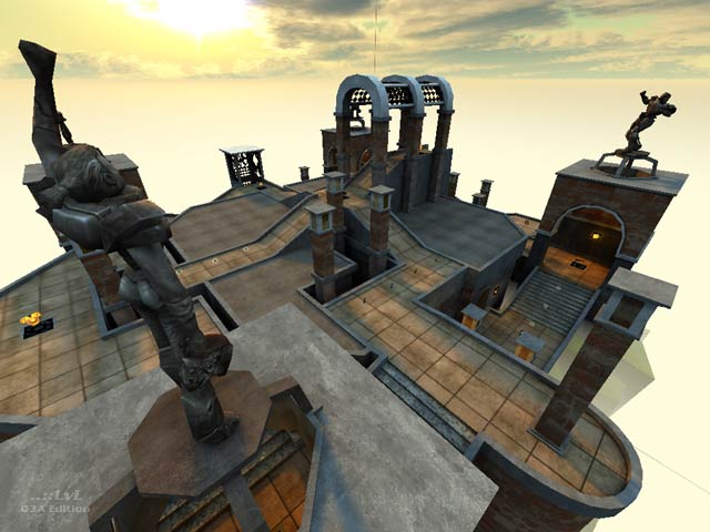
Prayers Nest II - Pray Again
Prayers Nest II - Pray Again by Hipshot
Comments
Add a comment
avatar
**Preview only**
Be sure to submit your comment
Formatting help
Submit
Preview
Cancel
Submitting comment...
avatar
raspatan Rep. 4660
#9   13 May 2020
It's a great map. A bit difficult to play with Major (default bot) because she has such an insane machingun aim. But really fun, even for a 1v1.
Agree (1) or Disagree (0)
avatar
KommissarReb (SW12) Rep. 2488
#8   12 Aug 2013
This map really does look heavenly compared to the "Outpost of heaven"!
Agree (0) or Disagree (0)
avatar
FragTastic Rep. 2459
#7   09 Jan 2012
Hosted this map online on my server and it was such a success that no one would vote for any other map except this one :). Great Work Hipshot!. 10/10.
Agree (0) or Disagree (0)
SW12 unregistered
#6   26 Dec 2010
What other space maps are flying in the clouds, with fog of death below?
Agree (0) or Disagree (0)
avatar
AEon Rep. 810
#5   23 Aug 2009
Amazing combination of style, architecture, and vision. Looks like a "masterpiece" out of an art class. The whole map has quite a surreal vibe to it. Interestingly the map actually plays better than one would expect, and you can't help but appreciate all the clever details.
Agree (1) or Disagree (0)
db unregistered
#4   29 May 2009
This reminds me of cardigan's Estatica. Very beautiful and plays well.
Agree (0) or Disagree (0)
avatar
v1l3 Rep. 1541
#3   14 Jun 2006
This map is a great floater. Nice story in the readme. Great sky, wish it didn't have lines though.

It's missing sounds:

sound\movers\plats\pt1_end.wav
sound\movers\plats\pt1_strt.wav

Agree (0) or Disagree (0)
avatar
bluemonkey Rep. 40
#2   29 Jan 2006
I have to say a big well done to the guy who made this level. It's certainly become one of my favourites just for having fun on. It has a real strange feeling to the flow of the game, looking at the screenshots it appears very open but in game it really doesn't feel that barren. There is a rail gun but I never really felt it that useful on the map which was a nice surprise as I love the open feel to it provided by the beautiful skybox and lighting while maintaining the kind of gameplay that never leaves you in a position feeling exposed and vulnerable. It boils down to some very well thought out sightlines, it all feels very meticulous.

There are tons of interesting features like the little courtyards that you can jump to from the arch, the holes in the floor that make you have to constantly watch where you are and the pillars with statues that can provide just the right amount of cover that are great gameplay touches. When jumping around the distances feel just right, you know that feeling you make when you do a jump across a chasm, land where the weapon is then barrel right through an enemy before hitting a jump pad back up?

As the others have said graphically it's amazing. The lighting is really good as it goes from very bright sunlight to the very dark lower area that can actually provide quite a bit of cover in some areas thanks to the contrast difference. The archway and jump pads look especially good. I really love the way the lining stretches over the flat areas too making it necessary to jump between the different flat areas if you want to go across the edges of paths.

Bots play the level well, they do tend to focus more on one side of the map but that's because it is where you tend to spawn. I found myself encountering combat all over the map though at some stage or other.

The weapon placement is excellent, nicely thought out so you spend the bulk of your time with using just a single weapon.

For vanilla Quake 3 I found this a very articulate map that has a lot of attention paid to the details. It's got beauty and good gameplay with bots or people.

Edited: 29.Jan.2006 17:06 UTC
Agree (0) or Disagree (0)
avatar
Mikko Sandt Rep. 100
#1   16 Jan 2006
I like the architecture (and the skybox fits the theme & colors) and the new effects on those jump pads. The level played pretty well with three bots and all of the level's items were well scattered around map (a Megahealth on top would have concentrated too much of the action topside).
Agree (2) or Disagree (0)
Clear