Added 03 Sep, 2004
Comments
Add a comment
**Preview only**
Be sure to submit your comment
Be sure to submit your comment
Submitting comment...
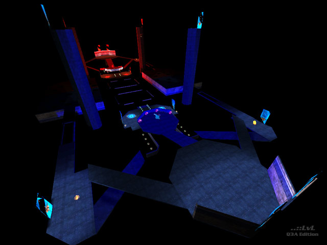
basically a map would have to be a hologrid box map with no clip brushes, bot support, or items for me to score it a zero, so the fact that it even has these things means it gets my baseline score. It could have been even worse if it wasn't for the fact that the locations of the powerful items and the fact that there was water was all pleasantly surprising, even comical, and in a way I think the author intended. I thought it was a space map so was very relieved when I first fell in the water. The pathways, well with well timed strafing they really presented no problem at all. I literally had to go out of my way to look for the BFG/Flight et al. But having said all that, I agree: the lighting was terrible. And the items made gameplay of any sort non-existent.
Agree (1) or Disagree (0)
Oh my this maps lighting is terrible. I have not seen a map darker than this and it is absolutely appalling. 0.5/10
Agree (0) or Disagree (0)
In my opinion the layout is quite ok; but here and there it's really SIMPLE brushwork. Far too dark.
Agree (1) or Disagree (0)
wow man!!!This is one trippy level man!!! 0/10
Agree (0) or Disagree (0)
