Added 08 Nov, 2003
Comments
Add a comment
**Preview only**
Be sure to submit your comment
Be sure to submit your comment
Submitting comment...
This looked very promising but.... it ended up being quite average. Corridors and elevators are quite tight. Some weapons are inside small caves, a very unorthodox and unhelpful design. Layout is indeed confusing, as AEon says. Also, in one single spree you can get MH + RG + YA + RA. That says how badly items are spread around. Textures are also a bit confusing, using jumpad ones for bouncers.
A disappointment.
A disappointment.
Agree (0) or Disagree (0)
I love the design of this map, though the layout, IMO, is confusing, and relies on TPs too much.
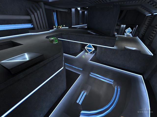
Good stuff: The JPs that throw you into a curved wall, letting the player take a 90° turn are fun, the glow tubing as deco is nice, the TPs are interesting in design, and the many clever idea in the geometry are pretty neat. I especially admire the "energy sparking rotating diamonds" in that map, awesome deco element.
Personally, I'd have dropped the TPs, and the sliding doors as well, and the area you can only access by ducking to get a 25 Health. I have never previously seen this map before, but it's uncanny to see vague similarities to my AEneon that was released much later.
Agree (1) or Disagree (0)
the megahealth red and yellow armour are too close together making it relatively easy to sweep all armours and the mh with the rg. not a pretty site when you're caught picking the pg or lg up. on the plus side there is good variety to the areas: open spaces, teleports, corridors, split levels meaning all weapons get used. the rg/lg dominate in this map but the flow is really nice
Agree (0) or Disagree (0)
Good Job.
(short and sweet. this maps good enough not to get a bitching, but not up there with the 16 paragraph praise i give some maps.)
7/10
Agree (0) or Disagree (0)
Thanks for the review and comments. If you like this level, you will probably love the level I am working on currently (guile09dm4). It takes place in a space/industrial enviroment. It is a little more spacious than this one and has lots of eye candy =)
Agree (0) or Disagree (0)
Good Stuff...eye-candy galore...nice combo of neon and glass. Fun for small groups.
Agree (0) or Disagree (0)
Nice work! This map plays mint in CPMA. Do you have any other maps in the works?
Agree (0) or Disagree (0)
