**Preview only**
Be sure to submit your comment
Reminds me of a Half Life map :). Brings me back in the days..
Agree (0) or Disagree (0)
Snake
unregistered
#20 02 Mar 2001
I don't like the pink.
Agree (0) or Disagree (0)
not entered
unregistered
#19 19 May 2000
This is a fun map. I never played the original whatever its converted from, but i like it. A keeper for me.
Agree (0) or Disagree (0)
lebowsky
unregistered
#18 24 Apr 2000
Hey [iF]Gonad. If I wanted to hear all about your high and mighty "from-scratch" conversion, I'd visit your webpage or something. Jesus, preach somewhere else will ya?
Anyway, this map is pretty cool even if it is a conversion from SiN. I never played SiN, never will, so it's new to me.
I guess you guys hate all remakes of songs and movies as well, huh?
Agree (0) or Disagree (0)
not entered
unregistered
#17 29 Feb 2000
I don't mind coversions,but I can do them my self with the Q2 TO Q3 converter in less than 5 minutes,that includes making a bot aas file.
Agree (0) or Disagree (0)
[iF]Gonad
unregistered
#16 28 Feb 2000
and bsp to map is not art either even if one changes the textures to his/her liking. It should all be done from scratch with your own twist to it.
I think most will agree with me here.
Agree (0) or Disagree (0)
[iF]Gonad
unregistered
#15 28 Feb 2000
I have to agree with Tigger-oN that bsp conversions suck ass. Those maps were made for the game they were made for. The scaling is off and the textures don't look as good as the originals. Then the authors gets all pissed off when they get a bad review as if like they put a lot of hard work into it. I'm sorry the computer did all the work. I hardly call it mapping at all.
If one wants to do a conversion do it the old fasioned way....By hand. It will look better, play better, And the scaling will be just right. Also when doing a conversion..put some imagination into it.
I'm redoing the old map Dead simple for the PureDm contest. All I'm doing is keeping to the basic layout while not making it so flat booring and square looking. I'm making it so that it looks like it was made for Q3A. No flat, walls, buildings, etc. It will also have natural terrain. I'm using mostly base textures and a custom night sky that I'm working on (fingers crossed that it turns out well...so far so good). I'm not going to tell you guys everything I'm doing to it..you'll just have to see.
I think by now you know what I'm getting at. Also this will be my only conversion that i'll release as it's for a contest as I enjoy my own map ideas. It's a doom2 map that will look way better than the orignal (Duh!) and most importantly (And you'll know I'm telling the truth) It obviously won't be a crappy bsp conversion that I'm going to slap my name on.
Agree (0) or Disagree (0)
Jim
unregistered
#14 27 Feb 2000
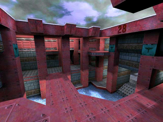
Its always nice to see someone create new textures for their map, and the textures for this one are made quite well, however, it was a bit too red for my liking.
I think the biggest drawback to this map is the layout and architecture. It needs something more, but I don't know what. Maybe just a little more ornamentation would have done the trick. The teleporters were also a little weird. I didn't know they were teleporters until I walked over them.
Not a bad map at all, just not my style.
Agree (0) or Disagree (0)
AssBall
unregistered
#13 27 Feb 2000
I have never played SIN, and probably never will, so I see this map as an original and look at it from a Quake 3 point of view only. That said, I think this is a very good level.
I didn't think the background was really bland at all. The choice of texturing gave the map a very cool "feel". More variety would have deviated from the theme.
The layout is nice, though seemingly a little oversized in places (though not to the point where it becomes anoying). The item/weapon placement was iffy in parts. Specifically, there is never a reason to have two red armors in a level like this. Also, I fail to understand the point of adding machineguns....?
Agree (0) or Disagree (0)
Redrum
unregistered
#12 27 Feb 2000
This is a strange map. I've always said to people that I would even play Q2 flat shaded on the grounds that it's the game mechanics, layout and interactions that make the game play.
I guess this map proves me wrong. Whilst the layout is not bad with a reasonable flow and ok connectivity I simply can't stand the blandness of the background.
The author has made some efforts at decoration (though it did seem very dark on my system). But at the end of the day I believe there are better maps out there that supply on both game play and eye candy. Not the mention technical execution. Hwoever no-ones perfect and we all muct start somewhere. I think Jon did a ok attempt at yet another conversion of a SiN map.
As a general point I've seen quite a few SiN maps converted and whilst I din't have anything against conversion per se I've always said that game engines are different and maps are built to suit both playability and those engines. SiN was basically a TC of a slower engine that included slower movement mechanics. As such th emap must be tailored differently. I like th ereal world feel SiN brough to the mix (much like Duke3D - how come there aren't more of those maps converted?) but in the end the maps fall flat on Q3.
Because by their conversionist nature they don't take into account the added benefits of the Q3 engine, weapon systems movement etc.
So while I try out evey map converted or not with an open mind and fresh attitude (even looking forward to some maps such as this one with fond memories) I often find they just don't work.
Agree (0) or Disagree (0)
AssBall
unregistered
#11 27 Feb 2000
Hey Viagra... If you review another level in your repetitive ebonics I think I'm going to throw up.
Agree (0) or Disagree (0)
TheEyeZ
unregistered
#10 27 Feb 2000
I love this map....I spent many hours running around it in SiN (fraggin the sh*t outta Dogface) ;-} I hardly ever play Q3, but you will be able to find me clickin on the Q3 exe when conversions of SiN maps are made.....afterall SiN ownz level design
Agree (0) or Disagree (0)
p1g4kr
unregistered
#9 27 Feb 2000
why do you sad bastards keep trying to drag your old toys into a new game
Agree (0) or Disagree (0)
old school SiNner
unregistered
#8 27 Feb 2000
(sigh)
this map is great
it played just like it did in SiN (the second best fps so far)
plus it looks damn good
"oh it's a conversion" "oh it's not original"
why is it everyone seems to love all the quake1 and quake2 conversions?
you people make me sad
Agree (0) or Disagree (0)
Tigger-oN
unregistered
#7 27 Feb 2000
Dogface - you answer your own question (well, a bit anyway). The orginal was made with for SiN. The orginal level author put a lot of time into making this level great. They beta tested it. They optimized it so that it would play the best it could with the SiN game engine. Then someone comes along and uses bspc.exe to extract a map file, uses some other program to rip/convert the textures from the original - thinking that because this map rocked hard in SiN its going to be cool in Q3A - sorry, but I don't think much of level convertors that try and make something of someone else hard work. esp when they can't even do a good job of it. Try /devmap sindm9 then noclip, see how bad this level is built? (incase you don't know what your looking for, you should not be able to see most of the outside walls)
Agree (0) or Disagree (0)
Dogface
unregistered
#6 26 Feb 2000
??? Who are you? I mean the rewiewer? That is one stupid opinion. Is your comment that the remake is not good or is that the original level is lousy? Have you played this map or the original map with 3 -5 good players? Allthough it looks a simple map with nothing new, it is a really good map. With this map you have to have a good strategy to win, and it has many variations of "strategy" I have had some really good games of sindm9. Also a good 1 - 1 map.
Ehh... my opinion might be just little bias since I think that sindm9 was the best map of sin, and Sin is (=was) the best game.
Agree (0) or Disagree (0)
dozer
unregistered
#5 26 Feb 2000
Whats up? I can understand spitting the dummy over conversions - but I don't think this is the map to do it on - there are some shockin' bad sin conversions - bad lighting, crappy textures - but this one is cool and so was railroad -the reviewer's opinion is only one opinion.
Agree (0) or Disagree (0)
qcken
unregistered
#4 26 Feb 2000
ya know you gotta just bite the balls and say i suck, blah, blah, blah and actualy make a decent sin map that isnt bsp convreted and desnt suck and i may actualy by q3, thersie i'll play sin if i want to pley sin maps
Agree (0) or Disagree (0)
Viagra
unregistered
#3 26 Feb 2000
Agree (0) or Disagree (0)
jon
unregistered
#2 26 Feb 2000
what are you smoking , you said all i did was a simple dos command and thats all, i guess i forgot that sin has shaders and q3 style elevators and telporters and so all i had to do was use a simple dos command and the map was finished!!! ahh not!!!! this is a fun map and you level review people piss me off !! no more maps for you!!!!
Agree (0) or Disagree (0)
RA Bitch
unregistered
#1 26 Feb 2000
This was one of the better DM maps in SiN. Looks like a good conversion. Too bad I hated the game. This map just bring back those old SiN memories.
Agree (0) or Disagree (0)

