Added 18 Jun, 2002
Comments
Add a comment
**Preview only**
Be sure to submit your comment
Be sure to submit your comment
Submitting comment...
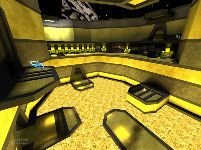
It's a pretty all round good map for me :). Gameplay is fine but I did have a problem with the texturing and colors. Yellow for the whole map doesn't suit at all but with Black it's a good combination but I wouldnt use it for the entire map though. Maybe some futuristic textures would of done it for me :). 7.5/10
Agree (0) or Disagree (0)
The author has worked with the texture limits of geocomp to his advantage to make for a pretty stylish and convincing map and if you strafe/bunny hop with the platform as it moves the length of the open area you get some speed up as well as making for a more difficult target. The magma in this level makes it interesting and if you use the teleporter in the MH to land a jump in the bays on either side of the power up you can avoid being an easy target. The light fittings in the wall and crates need to be lowered before calling this a cpma map but ammo/health can be reached from stairs
Agree (0) or Disagree (0)
And the Q1 revisions I´m talking about are dm4plus by Ledman and dm4ish by Aardappel, just if you wonder.
Agree (0) or Disagree (0)
Yeah xfoo you know that I wasn´t too serious when I called the teleporter in the MH room a "fix"...of course it´s part of the gameplay in dm4 to have a dead end there. But since this isn´t a true remake...
Agree (0) or Disagree (0)
"but some Q1 revisions already has this _fix_"
ROFL!
Agree (0) or Disagree (0)
no offense macho, but I really didn't like this map. Sure its a slight dm4 remake, but everything that has been done to it has been negative to the gameplay. Also, the scale is all wrong, and the yellow lava stuff in the middle is really annoying. The theme is okay, although yellow kinda gets annoying after awhile.
Agree (0) or Disagree (0)
I like the look, pretty interesting! Especially the doors and teleporters. And I wouldn´t call it a dm4 remake, it´s inspired by dm4 but the layout is quite different.
I found the teleporter in the Megahealth room a good change...yes, it´s not classic dm4, but some Q1 revisions already had this fix, so there must be a reason for it ;)
One thing I don´t like is the moving bridge in the atrium, it extremely hinders the gameflow in the lower level.
Agree (1) or Disagree (0)
Well, for starters it's a DM4 remake, but without a lot of the things that made DM4 interesting (such as the jumps, and connectivity). The author has also put his/her own spin on some of the rooms, namely the RA room. Secondly, the teleporters aren't placed in the best of areas of the map (middle of a hallway) ... and the mega room should NOT have a teleporter :D Finally, the quad can be reached by a strafe jump from the LG across or from the GL above down to it, quite simple actually.
Oh, and if it's made for CPMA, lower those boxes about 4 units so that you can double jump off of them.
Agree (0) or Disagree (0)
