


there's no shortcuts and there shouldn't be any... if you want to see the best maps you have to give many maps a try.
I think there is no need to think there is a 'elite' who only can judge a map from it's roots or only can judge the gameplay-quality of a map.
Thing is your position is very very subjetive as from the gameply it should be for a play in cpma.
The original spirit of reviewing a map or play a map shouldn't go this way. This way to judge a map is one view, how it would run under a very specialized mod.
A map should bring fun, ideas, architecture, solid gameplay and whatever.
Only to judge from the gameplay can't be the right way in the end. There are other aspects who are worth to look at imo.
And you cpma-reviewers are not the only ones who are in the situation to judge this way. Full stop. This is self-centred.
MopAn
....even tho you're wrong. :D
...hands down.
Obviously you've never played CPMA before.
We have taken over the reviewing here? We havent taken over. We're just more passionate about our levels' playability that's all. Theres NO ONE stopping other people from reviewing.
If CPMA players' reviewing is such an issue for you, "not entered", then take a stab at reviewing yourself. Mind you, I think I can safely say you would have no idea how to review the gameplay, and would waste our time with comments on brushwork and texturing, leaving little comment for what PLAYING the level is like.
Have a good new year chummer!
CPMA player and proud, The Hubster
BTW, I played this level in standard Q3A first, not in CPMA.
and "The best Q3A map for 2003..." - dude. hardly.
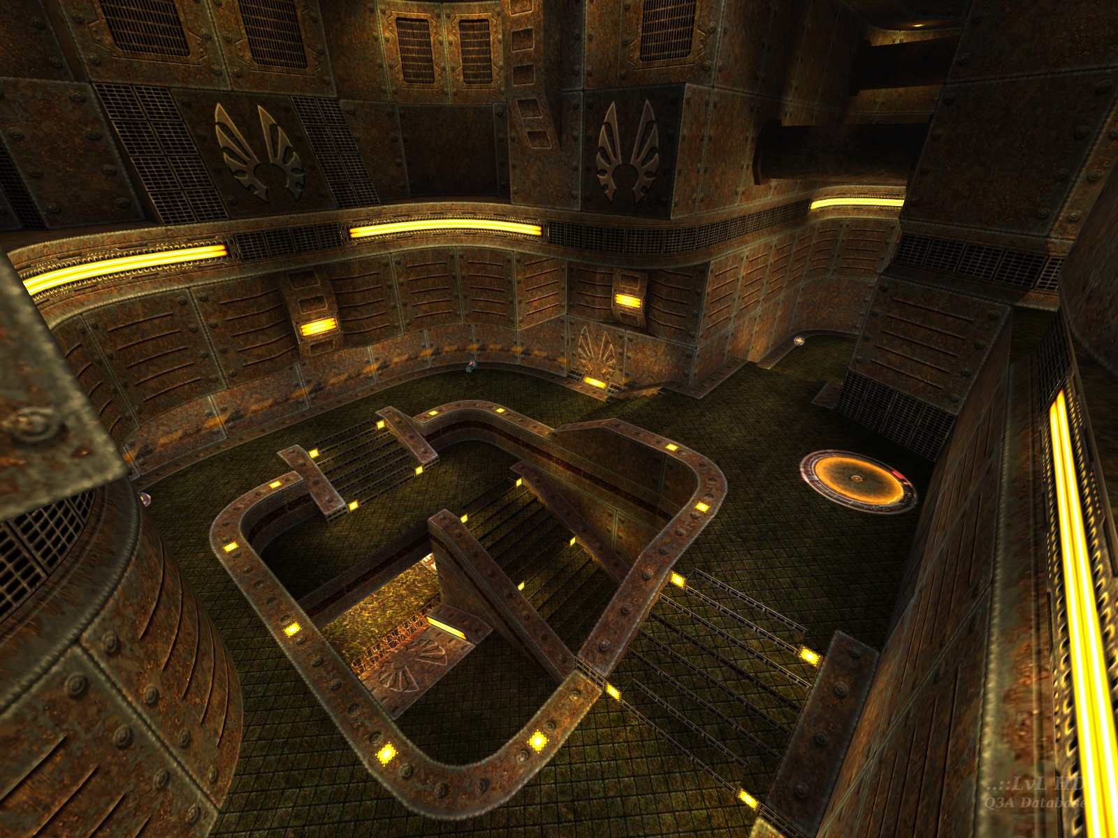
RPG - I had a real problem getting the light level right with this map. When the testers sent me back screenshots they were all really dark. So I reset my config to default & found that the map was dark with the default settings.
I then used the -scale setting in q3map2 to boost the light levels. The end result is that it looks as I intended under default config but under my normal config (& I suspect yours) it is too bright.
RPG - I had a real problem getting the light level right with this map. When the testers sent me back screenshots they were all really dark
Overall the visuals are top notch. I thought most of the walls were a bit too plain/flat, and the lighting also seemed to be overly bright/flat without much contrast. I didn't like some of the texturing (the grates down in the water seemed a bit odd and didn't make much sense structurally). The pipes and other bits that were way above the playing area were a nice touch that made the map seem more like an expansive place instead of just an arena. Overall the visuals were good, but I would have liked to see more interesting lighting and details.
I only played with a bot in vQ3, so I don't feel I should comment much on the gameplay; however, it seemed pretty good.
Rating: 9/10
P.S. Thanks, GlassMan, for pimping the other maps on this update. :)
CPMA doesn't need promotion from me but, if there are still doubters, it's worth trying for the far superior v1.2 bots alone (try skills over 81).
Also, the other maps in this update are high quality so make sure you take a look at them as well :)
Link if html doesn't work:
www.infosprite.com/modules.php the Next Life
thanks,
json
btw, nice work glassman :)
Good news: im not crazy!
Cool map.
Try the login on this page, www.gamespyid.com/index.aspx then come back to the download here. Or just grab it from the authors page :]
:)
Btw guys, try downloading from Glassman's webby, but not from Fileplanet :)
Loading...
Search for a map.
Results will appear here.
