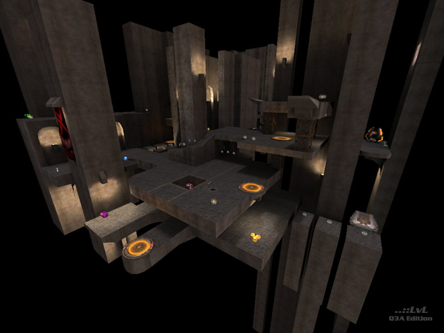
void744 is a kind of cross between a void map and a space map which seems to have been inspired, in part, by q3dm18. I've been trying to find a way of describing the feel of this map. I think the word I'm looking for is 'unfocused'. The map has no real heart to it. There is some layering, but the tiers above the RG area are small and cramped. The columns behind them could have been removed and those areas expanded to provide additional connections with the other side of the map. The connectivity often feels interrupted. A good example is the platform with the grenades and the armour shards. It's possible to get to it from the RG area, but not back there. If you don't make the jump to the PG area correctly, but don't want to exit via the ledge to the left, you have to jump back to the platform to make the jump again.
I think the map might have been better off without the jump out to the far platforms a la q3dm17. As a result of the gap between the two platforms, the bots often fell into the void when they try to make the jump across.
The lighting needed further work. Apart from one or two bright spots, the rest of the lighting is left to what occurs naturally, which is often dull or dark.
The item load appears to be all right, but some of the respawn times are annoyingly long. In the case of the RG, it's justifiable because of the potential opportunities for rail abuse, but I can't think what reason there might be to treat the LG in the same way.
The fraglimit in the arena file should be doubled. 10 is insufficient.
It is possible, somehow, for bots to get trapped in the void, but I could not detect where they might have fallen in. The bots had a tendency to go void diving and negative scores were not unusual.
Overall, this feels like a beta at best, but should really be relegated to the \Learning Experience folder.
Reviewed by Anwulf.
Ranked: 3.4 out of 5 (10 votes)
Download: Void 744 by Kali
