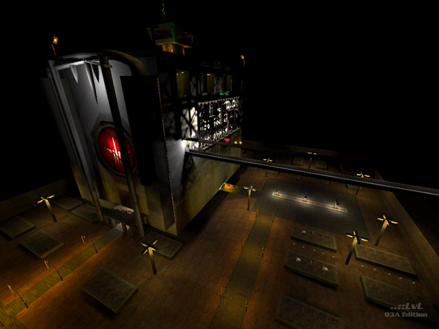
Lollypopdrop consists of a large building, surrounded by a square parking lot-like area. This building has many floors, all of which are bedeviled by intentionally dark and primary lighting. By primary I mean that the lighting consists of your primary color scheme, when, and if, it is applied. Stark yellows, reds, greens and blues rule the day. The author states that this is his "first beta release" of a map, and unfortunately it shows. There are many overlapping textures where the zebra effect shows up, and there are several places that textures don't seem to be used correctly. A primary example of this is the doorways that appear to have half a skin on them. The "innards" of this map just don't feel right. The author also states that he feels he is a map designer, and not a mapper. This is true and he would do well to hook up with someone to get his texture issues and ideas straightened out.
Add to these problems the fact that you can get off the map and into the surrounding sky box in some areas and the fact that I was pulling 15-20 fps in some places on my near top of the line system (3000Mhz, w/1 gig of ram and a 9800 pro) and the map becomes even less appealing. Beta is right. Not so much a DM level, as a building to explore. Gameplay is nearly nonexistent.
There exist a couple of interesting ideas within, but all-in-all; I have to say pass this one by.
Reviewed by Legrand [LN]
Ranked: 2.8 out of 5 (10 votes)
Download: lollypopdrop by independentkiller
