Brutality
Brutality by Brute
Comments
Add a comment
avatar
**Preview only**
Be sure to submit your comment
Formatting help
Submit
Preview
Cancel
Submitting comment...
*DARKEYES* unregistered
#6   17 Oct 2000
alien has good taste and he says this is the map so i would like to tryi t out too please?

Agree (0) or Disagree (0)
DBD unregistered
#5   21 May 2000
I have tried the new version and the work is obvious, some places look really nicer and the feeling I had about lack of details has disapeared.

The new arena file isn't ok. The type tag includes the value "single" which it sould never have. There's also some unsual thing as no quote used and bsp name which includes the extension.

Also in my opinion there's too many bots in the default setting.

Anyway, play with bots still doesn't work well. With the new version I even notice a possible decrease, they don't take anymore the quad damage. Most important, the play turns a lot in big melee, with most bots in a big room where you mostly just have to rush to fire in the pack outside the melee if possible.

I dunno if it's Q3A that doesn't suffer big sizes for bot play. I quote it, Overkill works better. Recently I stumble upon a map, q3sdm9 that also abuse of big sizes, even more than brutality. But about gameplay it works suprisingly well despite the big size. The choice of underpopulating the level is very uncommon but it works fine. But I don't think that it's why it works when, in my opinion, brutality doesn't.

For the new version with a real look improvement but gameplay still not working for me with bots, if not worse, I could gave it a 5. But I won't make a double rate which will just lower more his average making me double vote.

Agree (0) or Disagree (0)
Brute unregistered
#4   02 May 2000
I've gone through the map and fixed a ton of overlapping brushes and other texture errors. I'm pretty friggin embarrassed to have released it with all these goofs. The new version, in the current location, has the updates.
Agree (0) or Disagree (0)
DBD unregistered
#3   30 Apr 2000
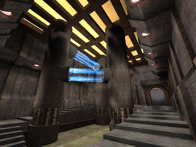
I played it only twice and didn't notice the stairs problem. What hurt me in this map, it's the very big sizes everywhere. I found this doesn't look good unlike for example for Overkill. I think it miss architecture details but I agree coloring and texturing has a cool little touch of originality. I didn't find the gameplay so good, just ok, in my opinion this is due to the systematic use of very big sizes removing diversity or subtility in the fights.

So overall I gave it a 4 mainly for its little touch of originality.

Agree (0) or Disagree (0)
Raven unregistered
#2   26 Apr 2000
SiCdeth, please don't barf on the screen ;) I really like it, it's got good game play, and the bot's have a good time, so I have a good time. Look forward to your next map. (hint)
Agree (0) or Disagree (0)
SiCdeth unregistered
#1   25 Apr 2000
i think that brute should have taken his time with this map, it seems like he rushed through it so that he can say "oh look i have a map on lvl too" it plays good but some of the elements are way too undone, and one thing that i totally hate is retarded stairs, the reason i call them this, is because its fine when u walk up them but on the way down ure either hooping or miss the stairs completey and it just makes me wanna barf on the screen.

(6)

Agree (0) or Disagree (0)
Clear