Added 09 Apr, 2000
Comments
Add a comment
**Preview only**
Be sure to submit your comment
Be sure to submit your comment
Submitting comment...
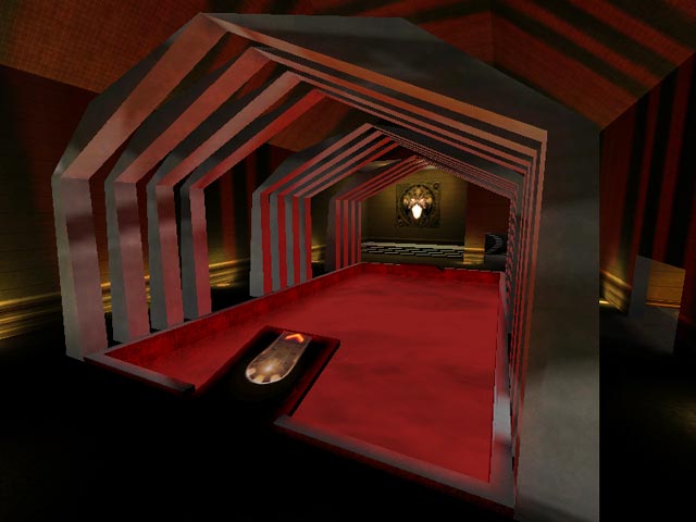
At a first look i was not impressed. A few touches here and there and it was basically boxy. But hey the frame rates are high.:) If some of the rooms were scaled down a little the game play would be better. Stangely i kept on playing and playing. Perhaps it was because i hate ranger. Whatever it was it is still fun. The bots never go to the upper levels. If they do its because they spawned there. Everything seems to connect ok..but the level was lacking an atmosphere. It felt tired. I can see where Kenneth was trying but even then it was to sparse. 6/10 The pit didnt even phase me when i was near it. The arches were like guide rails for the clumsy. Keep trying Kenneth..I see the potential it just needs to be aranged correctly.
Agree (0) or Disagree (0)
No its not a beta map,I am currently working on my second Q3 map and yes there will be curves and arches in it.Thanks for the input,I can use any good constructive comments.
Agree (0) or Disagree (0)
Isn't this supposed to be a beta map? Perhaps you should have worked on making more curves(b/c they are beautiful) and making it a bit more aesthetically pleasing(transitions from the dark to bright colors were not done well).
Agree (0) or Disagree (0)
