Be sure to submit your comment
Regarding darkness, there are two notes I should make.
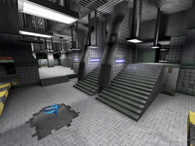
- You do not want camping to be too viable of an option. Regardless of how aware you are, the camper will still have the advantage of hearing sound cues and hiding either on top of the tracks or trenched within them. In the case of this map, most of the major items are behind the tracks, making them even more attractive, so in this case, you have a gameplay problem.
- With "pro" visual settings (featuring vertex lighting), all the dark areas are no longer dark anyway, so perhaps most of this discussion is moot. However, major areas should be more vulnerable and not so hidden.
You'll see... I can speak/read English but not very well, my weakest point are the expressions (Spanish is my language).
papri-K: good point of view. It's agreed! :)
I think the discussion here is interesting, because the darkness of some places in maps is often pointed out as a "negative aspect" of a map. (im not pointing to you, PI).
Tigger-oN is precise when he says "The very dark corners and tightness became of more a hindrance than a game play enhancement", because he leaves open the possibility that a dark corner can enhance game play (if it is used correctly).
This just came to my mind after playing the map kgbtourney1, where the author uses such dark areas(intentionally, imo). Result: when I played the map for the first time, it scared the $hit out of me when a silent bot caught me by surprise around a dark corner. The map made me feel emotions. Thats probably the principal reason why i decided to keep it.
Now I dont know if dark corners are "pro-able", but you can be sure that you need the most fine-tuned instincts and aim to shotgun-down your opponent just by hearing his steps.
Rail camping in a dark area? Yep, possible, thats why you should pay attention and trust your ears.
With these lines I'd like to encourage mappers as well as reviewers to give some more credit to "dark corners". They CAN enhance game play, imho. (im not saying that thats the
case for Mada Station, ok?).
If the darkness is too much, surely the map is pointless, you just cant enjoy the game, as it is strongly based on visuals. On the other extreme, an extremely evenly illuminated map does also look like a piece of plastic, doesnt it?
Ok, hope to get some feedback, ill check out the forum later.
Greetz
papri-K
What the bots do sometimes is to go behind the trains and then they don't know how to get out of there, so they stay there just quiet or running from left to right until you kill them.
I don't think the review is negative... maybe the reviewer just didn't like the map.
I found it tight and dark in some places too; and I found some console errors about a couple of .TGA textures.
Nice visuals, not so nice gameplay. :)
