Added 19 Feb, 2002
Comments
Add a comment
**Preview only**
Be sure to submit your comment
Be sure to submit your comment
Submitting comment...
First of all, I mostly agree with the review...second of all, the RG is not needlessly isolated. The map is not suggested for tourney, and this is a good map for the RG with long corridors and bouncepads aplenty, so making players go for the RG makes sense. That said it's not even that isolated, being near the Quad atrium. I completely agree about the MH an PG though, especially the latter...no one was bothering with it.
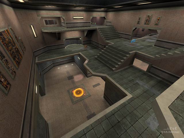
The layout (or which part of it you'll spend time in) is symmetrical, but makes good use of vertical and horizontal aspects for the most part. It's done in a pretty normal base theme with the usual emphasis on grey metal and other tones of the same stuff...not bad looking at all. Bouncepads are a bit plain though on their square pads, a custom model could really have spruced things up. But anyways it's a nice, run of the mill FFA, I dunno whether to give it 7 or 8...but a 7 I guess.
-Octovus
Agree (0) or Disagree (0)
